Tooltips are small pop-ups that display additional information when users hover over, focus on, or click an element in a React application. They enhance user experience by providing context without cluttering the interface. Based on recent research, six libraries stand out for their popularity, features, and community support. Below, we highlight these libraries to help you choose the best one for your needs.
Following are the top react tooltip libraries which we are going to discuss in this article:
- react-tooltip: Known for its simplicity, it’s ideal for quick setups using data attributes.
- Material UI Tooltip: Offers robust customization and accessibility, perfect for Material UI users.
- @tippyjs/react: Provides high customization and performance for complex designs.
- Floating UI: Best for developers needing full control to build custom tooltips.
- Chakra UI Tooltip: Seamlessly integrates with Chakra UI, offering easy customization.
- Radix UI Tooltip: Lightweight and accessible, ideal for unstyled, flexible components.
Table of contents
Best Tooltip Libraries for React JS
Tooltips are essential UI components that provide contextual information when users hover, click, or focus on an element. In React applications, implementing tooltips from scratch can be complex due to positioning, accessibility, and responsiveness challenges.
Fortunately, several React tooltip libraries simplify this process. This article explores the best 6 React tooltip libraries, focusing on their features, installation processes, and use cases, with a focus on the main keyword, React Tooltip. Whether you’re building a simple app or a complex interface, these libraries offer solutions for various needs.
React-tooltip

react-tooltip is a popular, lightweight library designed for simplicity and ease of use. It allows developers to add tooltips using data attributes, making it ideal for quick setups in React applications. With a straightforward API, it’s perfect for projects needing minimal configuration, such as dashboards or accounting software.
Features:
- Simple setup with data attributes (e.g.,
data-tooltip-id). - Supports hover, click, and focus triggers.
- Customizable styles and animations.
- Automatic CSS injection in newer versions (v5.13.0+).
- Lightweight with minimal dependencies.
Installation
- Install via npm:
npm install react-tooltip- Import the component and CSS (if using versions before v5.13.0):
import { Tooltip } from 'react-tooltip';
import 'react-tooltip/dist/react-tooltip.css';- Add to your
src/index.jsor equivalent:
import ReactTooltip from 'react-tooltip';

function App() {
  return (
    <>
      <button data-tooltip-id="my-tooltip" data-tooltip-content="Hello, world!">
        Hover me
      </button>
      <Tooltip id="my-tooltip" />
    </>
  );
}
Material UI Tooltip

Material UI Tooltip, part of the Material UI library, is a robust choice for developers already using Material UI in their projects. It offers extensive customization and strong accessibility features, adhering to Material Design guidelines.
Features:
- Seamless integration with Material UI components.
- Supports multiple triggers (hover, focus, click).
- Highly customizable with themes and props.
- Built-in accessibility (ARIA support).
- Responsive positioning.
Installation
- Install Material UI (if not already installed):
npm install @mui/material @emotion/react @emotion/styled- Import and use the Tooltip component:
import Tooltip from '@mui/material/Tooltip';

function App() {
  return (
    <Tooltip title="Tooltip content">
      <button>Hover me</button>
    </Tooltip>
  );
}
Check out the best React Template for your upcoming projects.

This is one of the best free vercel theme you can consider for your vercel projects.
Floating UI

Floating UI (formerly Popper.js) is a low-level, lightweight library for positioning floating elements like tooltips, popovers, and dropdowns. It’s perfect for developers who want full control over tooltip behavior and appearance.
Features:
- Precise positioning with middleware (e.g., offset, flip, shift).
- Supports React hooks for dynamic interactions.
- Platform-agnostic and lightweight (~3kB).
- Handles edge cases like viewport boundaries.
- Accessible with interaction hooks (hover, focus, etc.).
Installation:
- Install the React package
npm install @floating-ui/react- Set up a basic tooltip:
import { useFloating, offset, flip, shift, useHover, useInteractions } from '@floating-ui/react';
import { useState } from 'react';

function Tooltip() {
  const [isOpen, setIsOpen] = useState(false);
  const { refs, floatingStyles } = useFloating({
    open: isOpen,
    onOpenChange: setIsOpen,
    middleware: [offset(10), flip(), shift()],
  });
  const hover = useHover({ refs });
  const { getReferenceProps, getFloatingProps } = useInteractions([hover]);

  return (
    <>
      <button ref={refs.setReference} {...getReferenceProps()}>
        Hover me
      </button>
      {isOpen && (
        <div ref={refs.setFloating} style={floatingStyles} {...getFloatingProps()}>
          Tooltip content
        </div>
      )}
    </>
  );
}
Chakra UI Tooltip

Chakra UI Tooltip integrates seamlessly with the Chakra UI ecosystem, offering a simple yet customizable solution for projects using Chakra’s design system. It’s ideal for developers prioritizing ease of use and consistency.
Features:
- Native integration with Chakra UI’s theme system.
- Customizable via props (e.g., placement, colors).
- Supports hover and focus triggers.
- Accessible with ARIA support.
- Responsive and mobile-ready.
Installation
- Install Chakra UI (if not already installed):
npm install @chakra-ui/react @emotion/react @emotion/styled framer-motion- Import and use the Tooltip component:
import { Tooltip } from '@chakra-ui/react';

function App() {
  return (
    <Tooltip label="Tooltip content">
      <button>Hover me</button>
    </Tooltip>
  );
}
Radix UI Tooltip
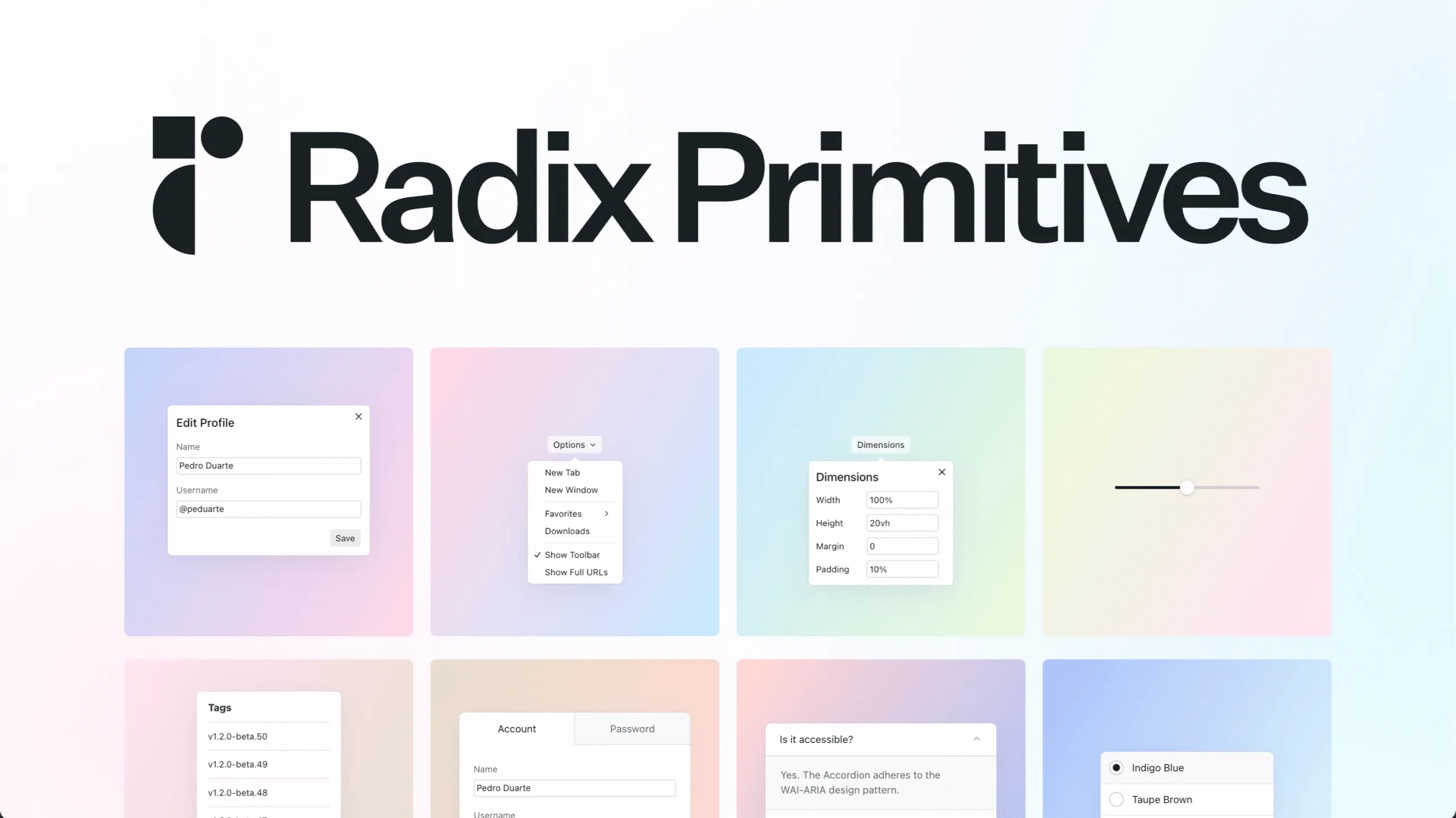
Radix UI Tooltip is a headless, unstyled library designed for accessibility and flexibility. It’s perfect for developers who want complete control over styling while ensuring robust accessibility.
Features:
- Headless, unstyled components for full styling control.
- Excellent accessibility with ARIA and keyboard support.
- Lightweight with minimal dependencies.
- Supports hover, focus, and keyboard triggers.
- Comprehensive documentation for easy setup.
Installation:
- Install the package:
npm install @radix-ui/react-tooltip- Import and use the component:
import * as Tooltip from '@radix-ui/react-tooltip';

function App() {
  return (
    <Tooltip.Provider>
      <Tooltip.Root>
        <Tooltip.Trigger asChild>
          <button>Hover me</button>
        </Tooltip.Trigger>
        <Tooltip.Portal>
          <Tooltip.Content>
            Tooltip content
            <Tooltip.Arrow />
          </Tooltip.Content>
        </Tooltip.Portal>
      </Tooltip.Root>
    </Tooltip.Provider>
  );
}
Ant Design Tooltip

Ant Design Tooltip is part of the Ant Design UI library for React, offering a customizable and flexible tooltip component that integrates seamlessly with other Ant Design components. It is actively maintained with regular updates and a strong community, making it a reliable choice for enterprise-level applications.
Features:
- Seamless integration with Ant Design’s ecosystem.
- Supports multiple triggers (hover, click, focus).
- Customizable appearance with themes and props.
- Accessible with ARIA support.
- Supports rich content, including text and components.
Installation
- Install Ant Design (if not already installed):
npm install antd- Import and use the Tooltip component:
import { Tooltip } from 'antd';
import 'antd/dist/antd.css'; // Optional for default styles

function App() {
  return (
    <Tooltip title="Tooltip content">
      <button>Hover me</button>
    </Tooltip>
  );
}
Conclusion:
The top six React Tooltip libraries—react-tooltip, Material UI Tooltip, @tippyjs/react, Floating UI, Chakra UI Tooltip, and Radix UI Tooltip—offer diverse options for enhancing React applications. Each library caters to different needs, from quick setups to highly customized solutions. Developers should evaluate their project’s requirements, such as ease of use, customization, or accessibility, to select the most suitable library.
Choosing the right React Tooltip library depends on your project’s needs. react-tooltip is great for quick, simple setups.
- Material UI Tooltip suits Material UI users needing robust customization.
- Floating UI offers maximum control for custom implementations.
- Chakra UI Tooltip is ideal for Chakra UI projects
- Radix UI Tooltip is perfect for accessible, unstyled components.
Evaluate your project’s requirements: such as styling needs, accessibility, and integration—and select the library that best aligns with your goals.
For further exploration, check the official documentation of each library for advanced use cases and examples. Start enhancing your React application with tooltips today!