Whether you’re running an eCommerce store, promoting a service, or capturing leads, the design and content of your landing page can significantly impact your conversion rates. For eCommerce brands running paid traffic to these landing pages, pairing the design with a dedicated ecommerce data platform ensures checkout, browse, and abandonment signals flow cleanly back to ad platforms — turning landing page traffic into optimized paid campaigns. In this article, we’ll explore the Key Elements of a high-converting landing Page, which can elevate your page’s performance and help achieve your business objectives.
That said, there are 9 core elements that every high-converting landing page must have:
- Compelling Headline
- Supporting Suheadline
- Clear Value Proposition & Persuasive Copy
- Strong call-to-action
- Engaging Visuals (Hero Image or Video)
- Social Proof & Trust Signals
- Exit-intent Popups
- User-friendly Form
- Clean, Mobile-optimized
We will break down each in this article. We will also discuss the other elements.
Table of contents
What Is a Landing Page?
A landing page is a dedicated webpage designed with a specific goal in mind, such as generating leads, promoting a product, or driving event registration.
Unlike general website pages, which may have multiple objectives, a landing page focuses solely on one goal to guide visitors toward taking a desired action, making it highly effective for digital marketing campaigns.
Importance of Landing Pages:
- Focused Objective: Designed for one goal (e.g., lead generation), boosting conversions.
- Enhanced User Experience: Clear, distraction-free path for visitors to take action.
- Higher Conversion Rates: Tailored CTAs improve conversion chances.
- Data Collection: Gather insights to refine marketing strategies.
- Improved Campaign Performance: Optimized for campaign success and results.
- Segmentation & Personalization: Customizable for specific audience segments.
- Cost-Effectiveness: High ROI with minimal investment.
- Increased Trust & Credibility: Builds trust, encouraging action.
Benefits of Landing Pages:
- Increased Conversion Rates: Focused on a single goal, landing pages drive higher conversions by removing distractions.
- Targeted Messaging: Tailor content to specific audiences for more relevant and persuasive communication.
- Improved ROI: Efficient use of marketing budgets by delivering a focused, high-conversion experience.
- Data Collection: Gather valuable visitor data to enhance marketing efforts and optimize future campaigns.
- A/B Testing Opportunities: Test different elements (headlines, CTAs, designs) to continually improve performance.
- Enhanced User Experience: Streamlined design and clear messaging make it easier for visitors to take action.
- Lead Nurturing: Capture leads effectively and guide them through the sales funnel.
- Better Tracking: Monitor performance and refine strategies with specific, measurable goals.
What Are The Key Elements of a High-Converting Landing Page?
In the fast-paced digital landscape of 2025, a high-converting landing page remains a cornerstone of effective online marketing.
Unlike a standard homepage, a landing page is a targeted, standalone web page designed to guide visitors toward a single action—whether it’s signing up for a newsletter, downloading a resource, or making a purchase.
With rising competition and shorter attention spans, incorporating proven key landing page elements can boost conversion rates by 20-80%, according to industry benchmarks.
This article dives deep into these essential components, drawing from expert analyses and real-world examples with direct links. Whether you’re building from scratch or using an intuitive landing page builder, these insights will help you craft pages that not only attract but convert visitors into loyal customers.
Compelling Headline
Credit: Dribbble
Motive: A compelling headline grabs the visitor’s attention immediately and sets the tone for the rest of the page.
The headline is your landing page’s first impression, often determining whether a visitor stays or bounces within seconds. It must clearly communicate the core value proposition, addressing the visitor’s pain points and promising a solution. In 2025, with AI-driven personalization, headlines should be tailored to specific audience segments for maximum relevance.
A strong headline is concise (ideally under 10-15 words), benefit-oriented, and aligned with the traffic source, such as matching ad copy to reduce cognitive dissonance. Use action verbs and power words like “Boost,” “Unlock,” or “Transform” to evoke urgency and excitement. Matching the headline to the traffic source is exactly the kind of detail paid media agencies obsess over, since a mismatch between ad copy and landing page messaging is one of the fastest ways to lose a visitor who just clicked.
Tips and Best Practices:
- Test variations with A/B tools to find what resonates.
- Ensure it’s above the fold for immediate visibility.
- Avoid jargon; focus on clarity and emotional appeal.
Why is it a Key Element of a High-Converting Landing Page?
The headline is the first thing a visitor sees, and it plays a crucial role in persuading them to stay on the page. If the headline doesn’t resonate with the visitor, they are likely to leave without taking action.
Examples:
The following are some of the inspiring examples of sites that use compelling headlines in their landing page.
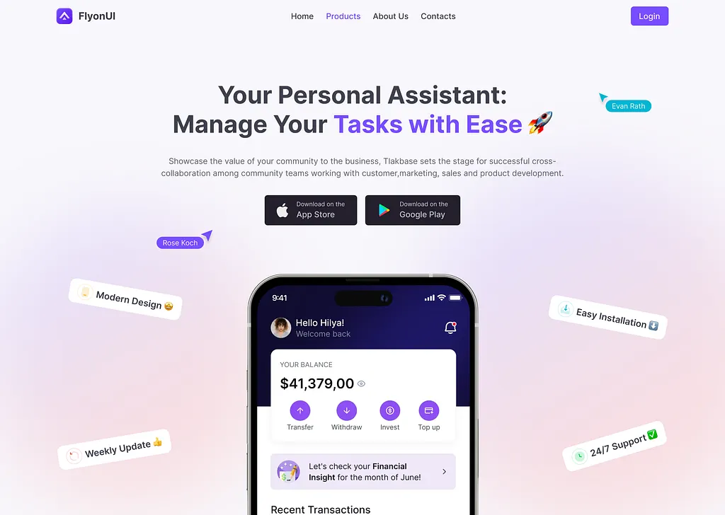
FlyonUI:
“The Easiest Effortless Seamless UI Component Library for Tailwind CSS”
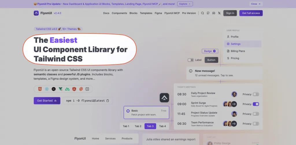
- This headline speaks directly to developers by focusing on ease of use, efficiency, and seamless integration, making it clear that FlyonUI is designed to save time and effort. The choice of words like “effortless” and “seamless” highlights the smooth experience users can expect.
Calm:
“Calm your mind. Change your life.”
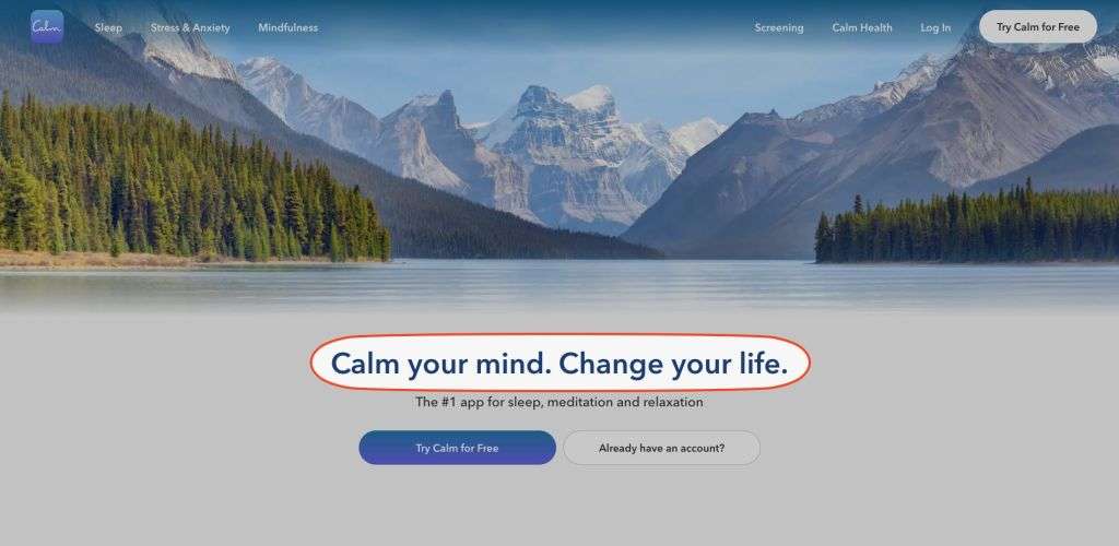
- This headline is effective because it directly addresses the visitor’s emotional needs and creates a sense of hope and improvement, encouraging them to engage with the app.
Supporting Subheadline
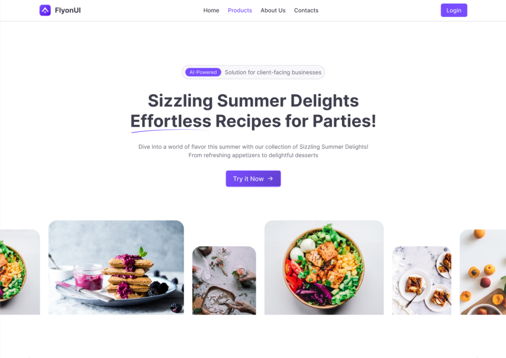
Credit: Tailwind Hero Section Blocks by FlyonUI
Motive: A supporting subheadline further elaborates on the headline by providing more detail and clarifying the visitor’s query.
Complementing the headline, the subheadline provides additional context, elaborating on the offer without overwhelming the reader. It bridges the gap between intrigue and understanding, reinforcing the value proposition and guiding visitors deeper into the page.
Keep it brief—1-2 sentences—and benefit-focused, expanding on the headline’s promise while addressing potential objections. In 2025, incorporate personalization elements, like referencing user data from ads.
Tips and Best Practices:
- Use it to highlight a key benefit or next step.
- Employ contrasting font sizes for visual hierarchy.
- Ensure readability on mobile devices.
Why is it a Key Element of A High-Converting Landing Page?
The supporting subheadline works in tandem with the headline to further clarify your value proposition. It reinforces the message and provides more detail without overwhelming the visitor.
A well-crafted subheadline answers the visitor’s “What’s in it for me?” question, giving them a reason to continue exploring the page, which is crucial for maintaining engagement and increasing conversions.
Examples:
The following are some of the inspiring examples of sites that use supporting headlines in their landing page.
Jetship NextJS Starter Kit:
“Ship Faster and Focus on Growth with JetShip, a Next.js Starter Kit built on the modern Tech Stack.”

- The subheadline supports the main headline by explaining how JetShip makes SaaS launch possible—through a Next.js Starter Kit and a modern tech stack. It reassures users that JetShip isn’t just about speed, but also about growth and scalability. This ties the promise of quick SaaS launch to long-term success, strengthening the value proposition.
- Mentioning Next.js Starter Kit and modern Tech Stack makes the offering tangible and credible, appealing directly to the target audience of developers and SaaS founders.
Revolut:
“For those who want more from their money — there’s Revolut. Sign up with no fees, in a tap.“
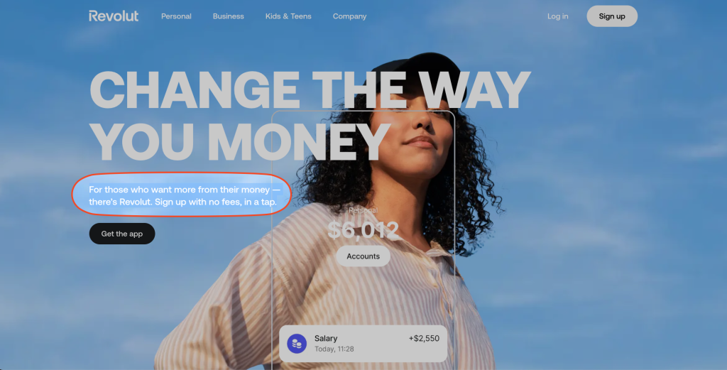
- The subheadline clarifies the website’s focus, providing authority and expertise while offering specific value, which builds trust with users looking for reliable health and weight loss resources.
Clear Value Proposition and Persuasive Copy
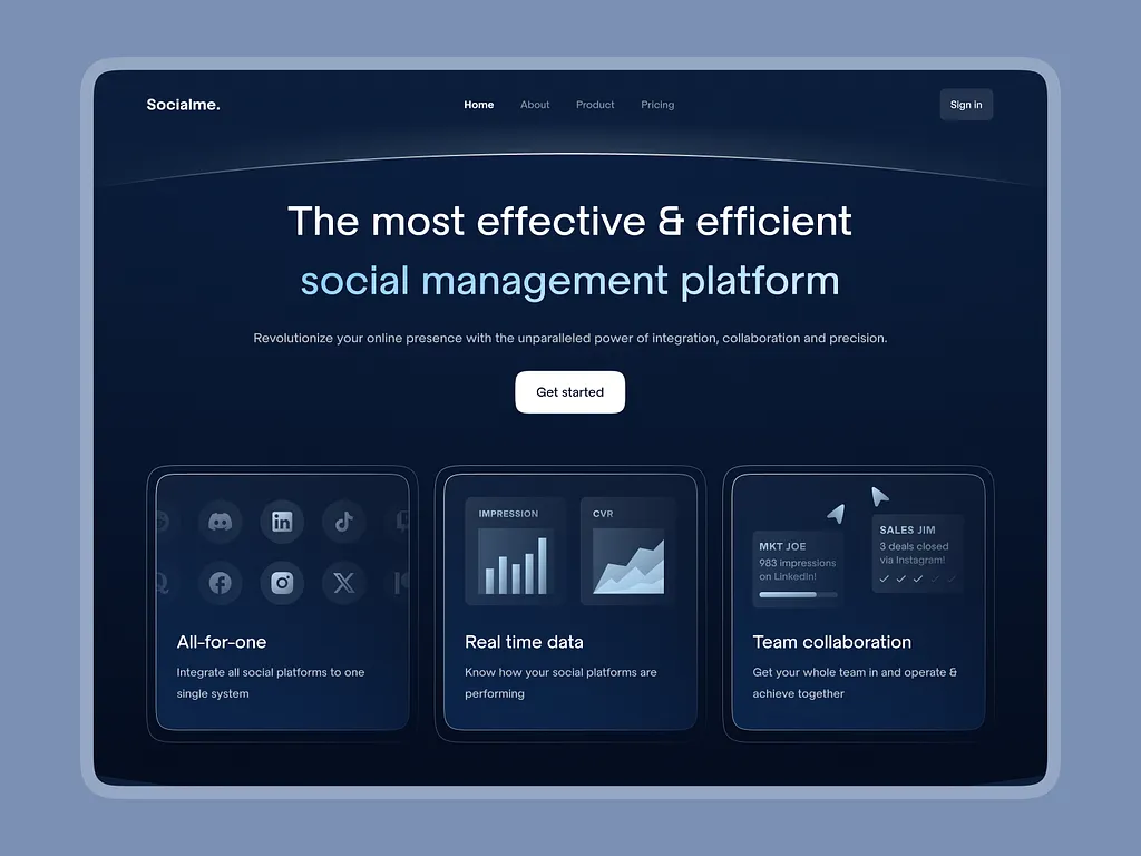
Credit: Dribbble
Motive: To clearly communicate the unique benefits of your product or service and convince visitors why they should take action.
The core copy should articulate what the user gains, emphasizing benefits over features to emotionally connect and drive action. In today’s market, copy must solve problems, build urgency, and use storytelling to engage. That’s also where teams often need to humanize AI content, making sure it sounds natural and connects with readers on a more personal level.
Structure copy with bullet points for scannability, focusing on outcomes like time savings or revenue growth, and screen AI-assisted drafts through a college AI detector so the final wording feels original. Integrate power words and address the “what,” “how,” and “why” to inform without overload.
Tips and Best Practices:
- Use short paragraphs and subheadings.
- Incorporate urgency with phrases like “Limited Time Offer.”
- A/B test for tone—persuasive vs. informative.
Why is it a Key Element of a High-Converting Landing Page?
Visitors need to understand the value your offer provides. A strong value proposition increases trust and encourages visitors to convert.
A clear value proposition explains the unique benefits your product or service provides, giving visitors a reason to take action. Persuasive copy highlights why your offer is valuable and addresses the visitor’s needs, pain points, or desires.
This element builds trust, fosters urgency, and convinces visitors that your solution is the right choice, which ultimately drives conversions.
Examples:
The following are some of the inspiring examples of sites that use a Clear Value Proposition and Persuasive Copy in their landing page.
FlyonUI Figma Design System:
“FlyonUI offers 1000+ Tailwind Figma component variants, 500+ blocks, 20+ templates, 4 themes & more with an intuitive drag-and-drop builder.”
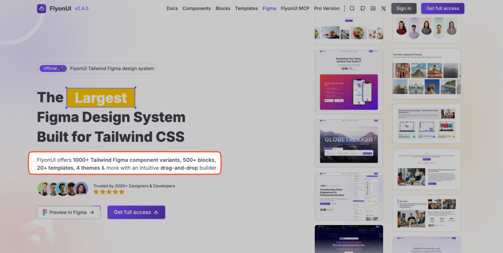
- This clearly shows the extensive toolkit available. The addition of an “intuitive drag-and-drop builder” emphasizes ease of use, making it accessible even for non-technical users. This concise, benefit-focused approach immediately conveys the product’s value and appeals to the target audience of designers and developers
Chatflow AI:
“Transform Your Website With AI Customer Support That Actually Works.”
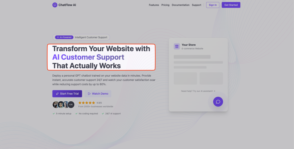
- The ChatFlow AI example provides a strong value proposition with its headline: “Transform Your Website with AI Customer Support That Actually Works”. It clearly communicates the benefit—AI-powered customer support—and emphasizes reliability with “That Actually Works”. The supporting copy highlights fast setup, 24/7 support, and up to 80% cost reduction, appealing to businesses seeking efficiency and cost savings.
Spotify
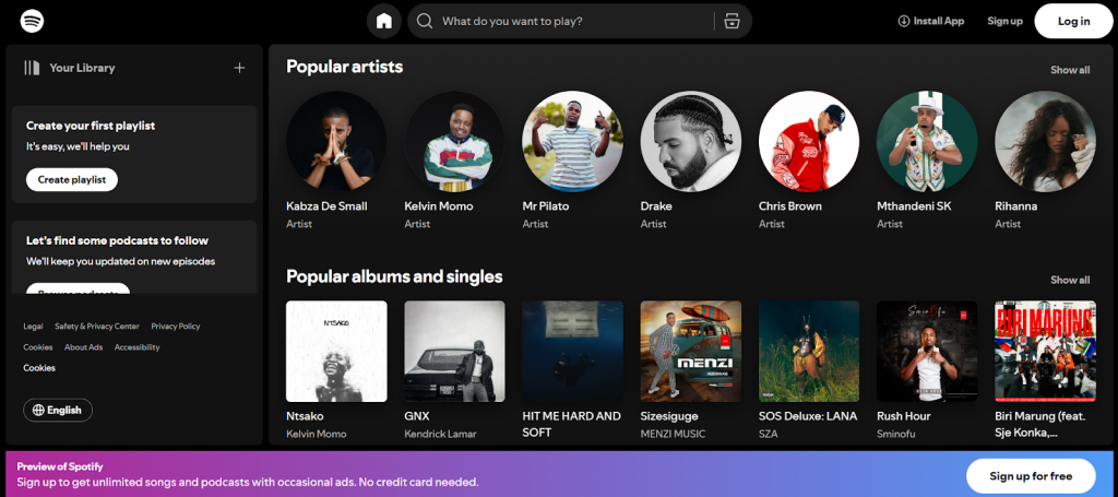
- Spotify’s landing page immediately communicates its core value—access to a vast library of music, podcasts, and personalized recommendations. The messaging is straightforward and highlights the key benefits for the user.
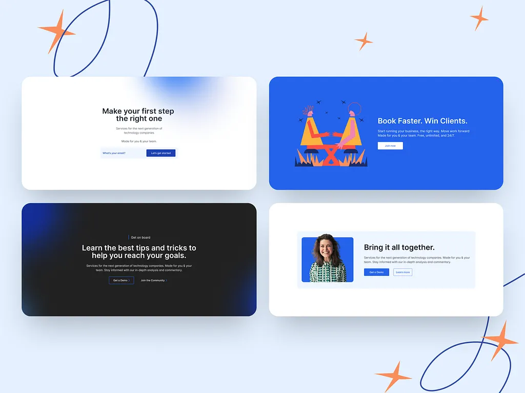
Strong Call to Action (CTA)
Credit: Dribbble
Motive: A strong CTA encourages the visitor to take immediate action, like signing up, making a purchase, or downloading content.
The CTA is the conversion engine, prompting the exact next step with clear, action-oriented language. It should be visually dominant and repeated strategically.
Design CTAs with contrasting colors, benefit-focused text like “Get Started Free,” and placement above the fold. In 2025, use dynamic CTAs that personalize based on user behavior.
Tips and Best Practices:
- Limit to one primary CTA per page.
- Add directional cues like arrows.
- Test button shapes and sizes.
Why is it a Key Element of a High-Converting Landing Page?
The CTA is the final nudge visitors need to take the desired action. Without a strong, clear CTA, visitors may be left uncertain about what to do next.
A compelling CTA directs users toward the next step, whether it’s signing up, making a purchase, or downloading content.
It’s essential for converting interest into measurable results, making it a cornerstone of any high-converting landing page.
Examples:
The following are some of the inspiring examples of sites that use a Strong Call-To-Action in their landing page.
Ooba:
“Pre-Approve Me.” & “Apply Now”
“Get Pre-approved & “Get a Home Loan”
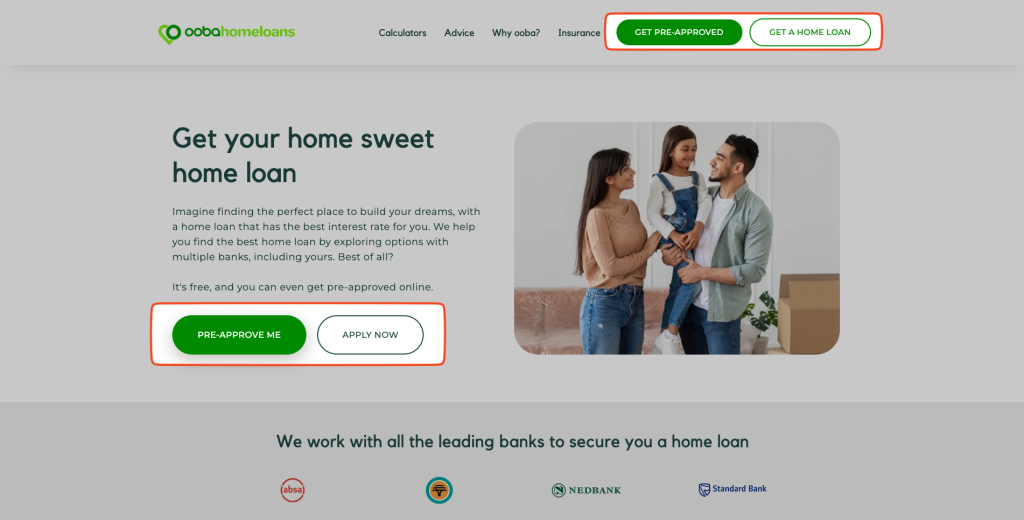
- A simple and action-driven call that invites users to begin their process without hesitation. It creates a sense of urgency and an immediate next step.
2Stallions:
“Book your consultation.”
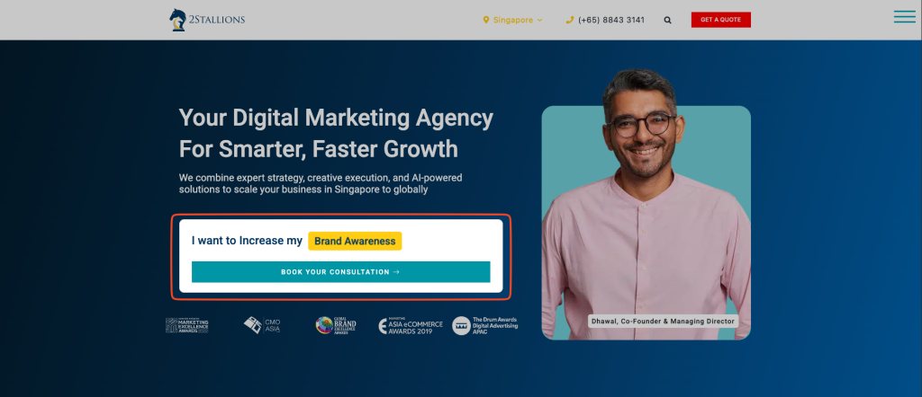
- The CTA is highly conversational, making it approachable and encouraging users to start a consultation. It’s a strong invitation for potential clients to engage without pressure. It also makes it engaging by changing the key purposes like “Brand Awareness”, “Leads”, etc, which clearly shows what visitors can get by taking their services.
Engaging Visuals (Hero Image or Video)
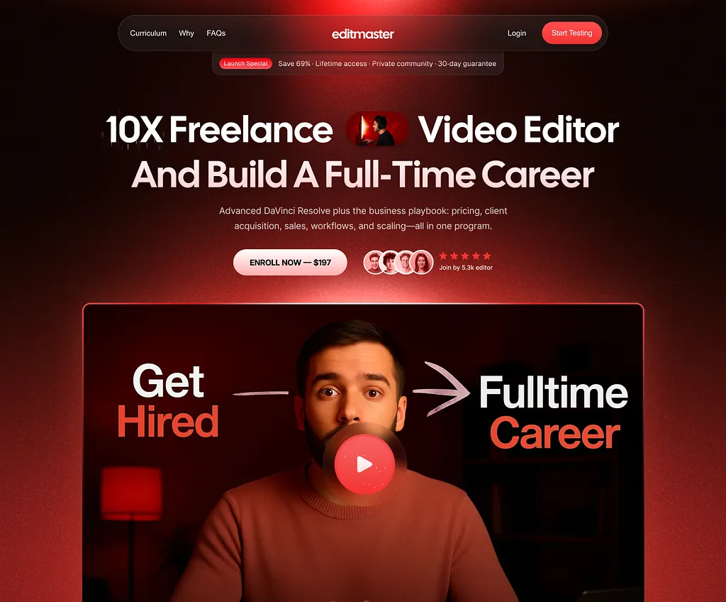
Credit: Dribbble
Motive: To visually engage visitors and support the messaging on the page.
Visuals illustrate the offer, evoking emotion and aiding comprehension faster than text. Hero elements should be relevant and high-quality. Using design templates helps maintain visual consistency across hero sections while speeding up creation and ensuring the layout aligns with brand and conversion goals.
Opt for videos to boost engagement by up to 80%, or images with deictic gaze to direct attention. Ensure fast loading to maintain user experience.
Tips and Best Practices:
- Use lifestyle or product-in-use images.
- Compress files for speed.
- Test video vs. static for your audience.
Why is it a Key Element of a High-Converting Landing Page?
Engaging visuals create an emotional connection with the visitor, helping them quickly grasp what your product or service is about.
A hero image or video that directly relates to your offering can explain complex concepts in seconds and establish the context for the landing page.
By visualizing the product in action, visitors are more likely to feel engaged and persuaded to take action.
Examples:
The following are some of the inspiring examples of sites that use an engaging hero section and elements in their landing page.
FlyonUI:

- A clean, minimalist hero image with a UI component example in use. The visual directly relates to the product’s core offering and enhances the user’s understanding of how the components can be used in real-life scenarios.
Addidas:
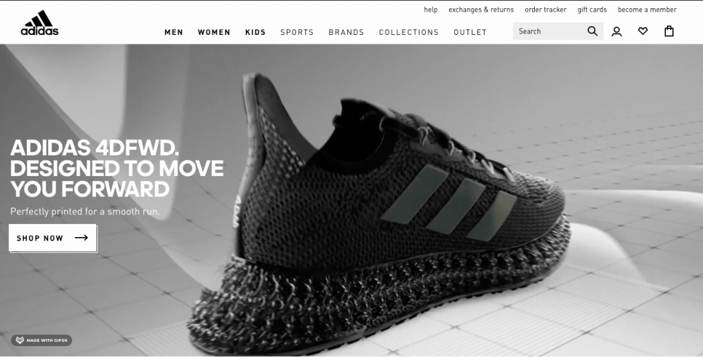
- This energetic background video landing page showcases the new Adidas 4DFWD running shoes in a way that instantly hooks visitors.
- The slow-motion effect as the shoe hits the ground highlights the cushioning offered, and the animated forward-moving arrows give the impression of speed and smoothness – all qualities that are no doubt important to people landing on the page
Social Proof and Trust Signals
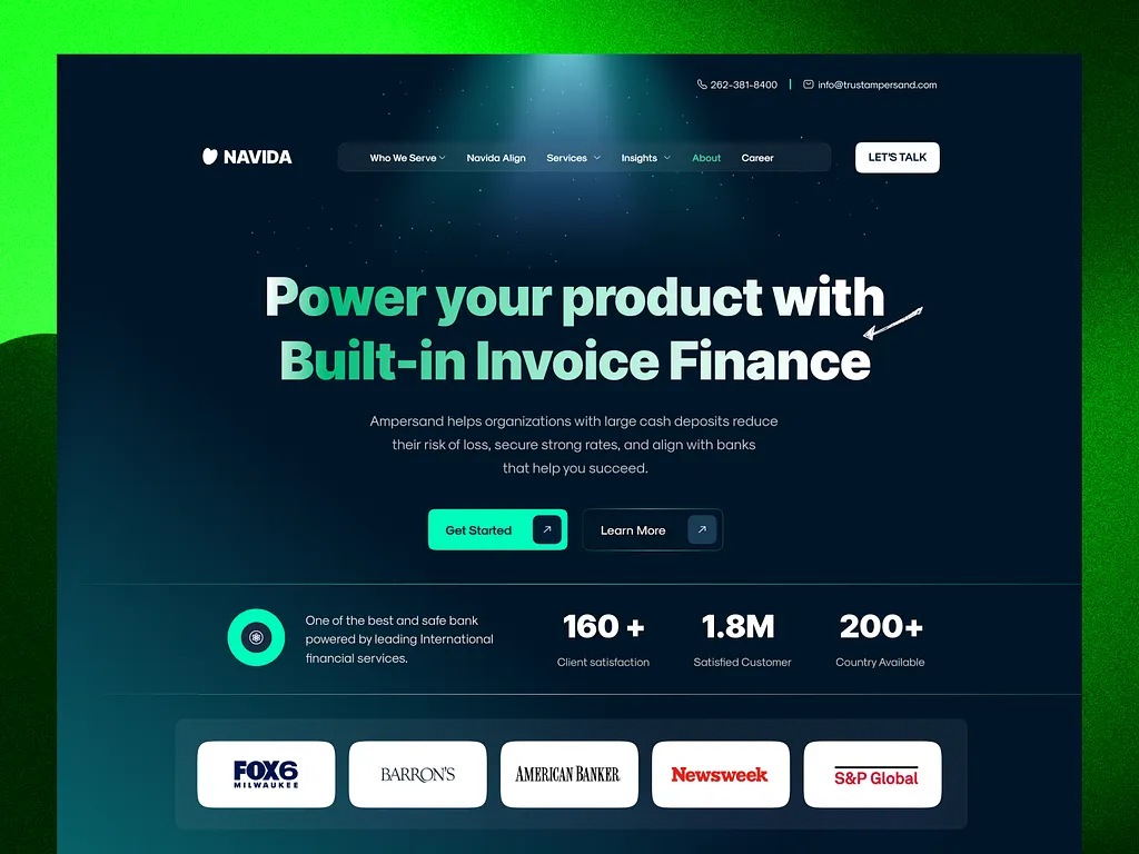
Credit: Dribbble
Motive: To build credibility and trust with visitors through testimonials, reviews, and recognitions.
Build credibility with testimonials, reviews, logos, or guarantees to alleviate doubts and foster trust. Include specific, authentic proof like quotes with photos, placed near CTAs. Security badges like SSL enhance perceived safety.
Tips and Best Practices:
- Use video testimonials for impact.
- Quantify results (e.g., “30% sales increase”).
- Integrate throughout the page.
Why is it a Key Element of a High-Converting Landing Page?
Social proof, such as testimonials, reviews, or client logos, provides validation for your offer. Adding a social media widget can also amplify this validation by providing real-time visibility into positive feedback. Visitors are more likely to trust your business if they see that others have had positive experiences.
Trust signals, such as security badges or media mentions, help alleviate concerns about privacy and reliability. These elements build credibility, foster trust, and increase the likelihood of conversions.
Examples:
The following are some of the inspiring examples of sites that use social proof in their landing page.
Misfits Market:
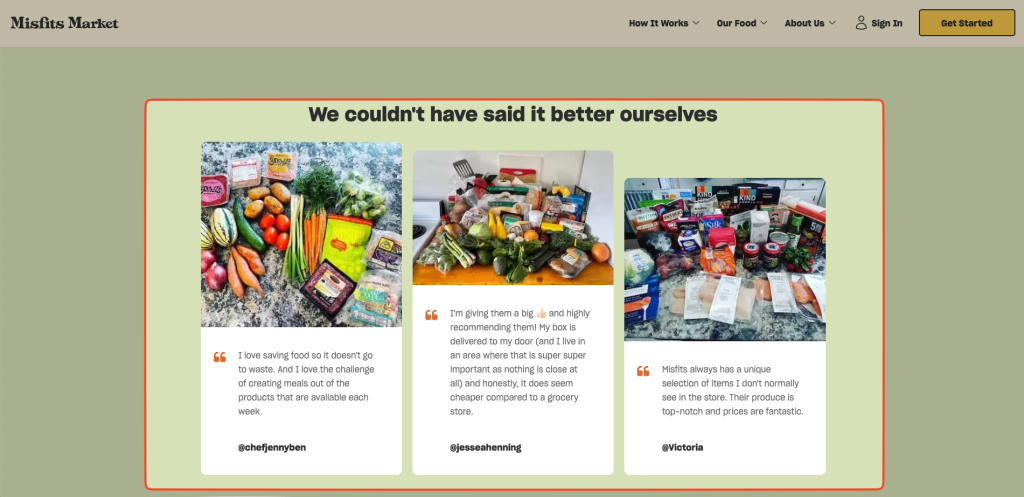
- Produce subscription service Misfits Market shares a few Instagram posts from the wild on its landing page. By using both the image and the caption, Misfits Market gets beautiful visuals and subscriber testimonials.
FlyonUI:
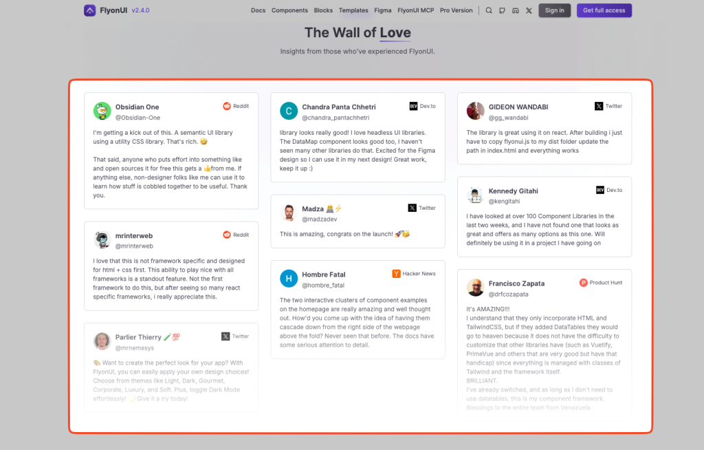
- The “Wall of Love” displays genuine feedback from users across various platforms like Reddit, Twitter, Dev.to, and Hacker News. These testimonials help build trust and credibility by showing real-world experiences from developers and designers who have used FlyonUI.
- By featuring a diverse range of users (different platforms, professional backgrounds), the content appeals to various types of visitors and fosters a sense of community around the product.
Stripe:
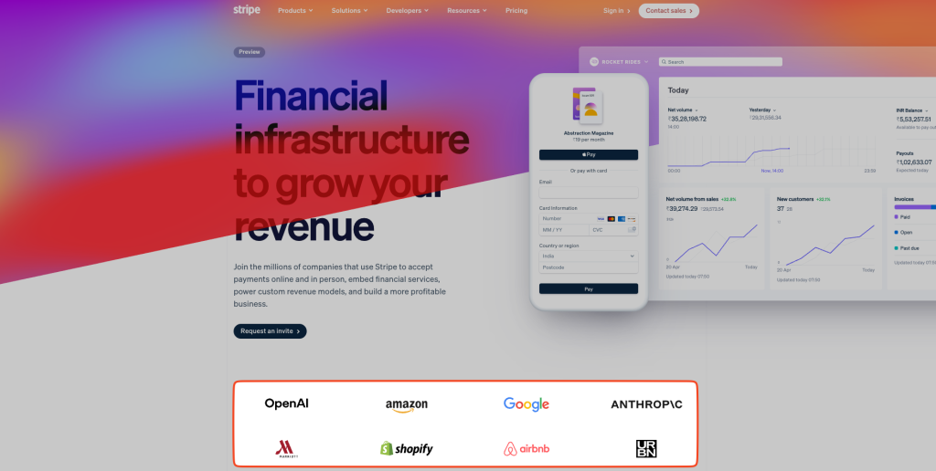
- The section showcasing “Join the millions of companies that use Stripe” immediately highlights that Stripe is trusted by major, well-known companies such as OpenAI, Amazon, Google, Shopify, Airbnb, etc. This establishes credibility, as new visitors will trust a product used by leading companies in the industry.
Exit-Intent Popups
Credit: Dribbble
Motive: To capture visitors who are about to leave the page by offering a last-minute incentive or information.
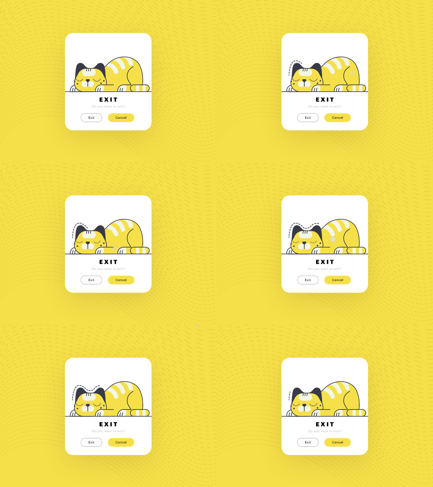
Exit-intent popups detect when a user is about to leave the page (e.g., by tracking mouse movement toward the browser’s close button) and display a targeted offer to retain them. These can increase conversions by capturing users who might otherwise abandon the page.
Design popups with a clear value proposition, such as a discount or free resource, and a strong CTA. Ensure they are non-intrusive and easy to dismiss to avoid frustrating users. In 2025, AI-driven pop-ups can personalize offers based on user behavior, boosting effectiveness.
Tips and Best Practices:
- Use compelling offers like “10% Off Before You Go.”
- Optimize for mobile with simple, touch-friendly designs.
- Test timing and triggers to avoid annoyance.
Why is it a Key Element of a High-Converting Landing Page?
Exit-intent popups capture visitors who are about to leave your site, offering a last chance to engage them with an incentive or message.
This tool can help recover potential lost conversions by offering discounts, free trials, or valuable content. When used strategically, exit-intent popups can effectively reduce bounce rates and maximize the value of each visitor.
Examples:
The following are some of the inspiring examples of sites that use pop-ups in their landing page.
OptinMonster:
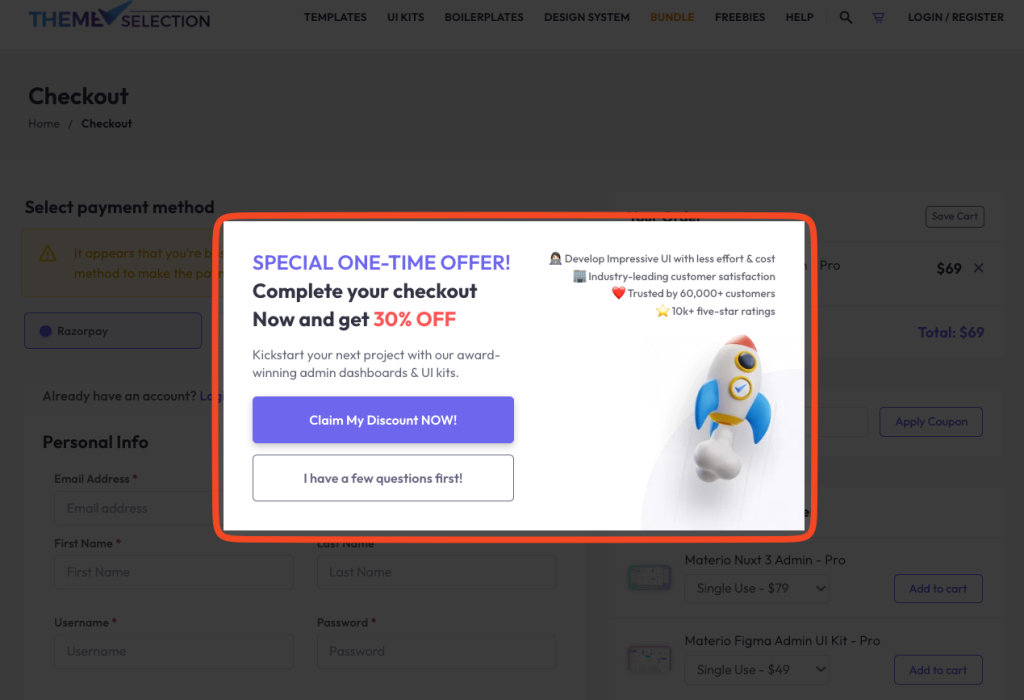
- Implements highly-targeted exit-intent popups with compelling offers to retain visitors and encourage subscriptions, reducing bounce rates and increasing conversion opportunities.
- The above example is of ThemeSelection, which uses OptinMonster pop-up. When the customer is about to leave, it appears with a 30% discount offer with the option to interact before completing the purchase case the user has any doubts. This makes the user stay on the page longer. It can change their mind before they leave the site or even get in touch with the support team if they want to ask any questions.
User-Friendly Form
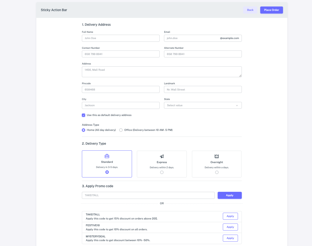
Credit: Sneat Bootstrap Template by ThemeSelection
Motive: To make it easy for visitors to provide their information without hassle.
Forms should minimize friction with few fields, clear labels, and privacy assurances to encourage submissions. Limit to essentials like email, and position prominently. Use progressive disclosure for complex data.
Tips and Best Practices:
- Add “Clear Fields” if needed.
- Mobile-optimize for touch.
- Include guarantees like “No Spam.”
Why is it a Key Element of a High-Converting Landing Page?
A user-friendly form removes friction from the conversion process, making it easy for visitors to take the next step. Long, complicated forms can deter users, while simple, concise forms increase the likelihood of submission.
Ensuring your form is easy to understand and quick to complete improves user experience, reduces drop-offs, and leads to higher conversion rates.
Examples:
The following are some of the inspiring examples of sites that have interactive forms in their landing page.
Airbnb:
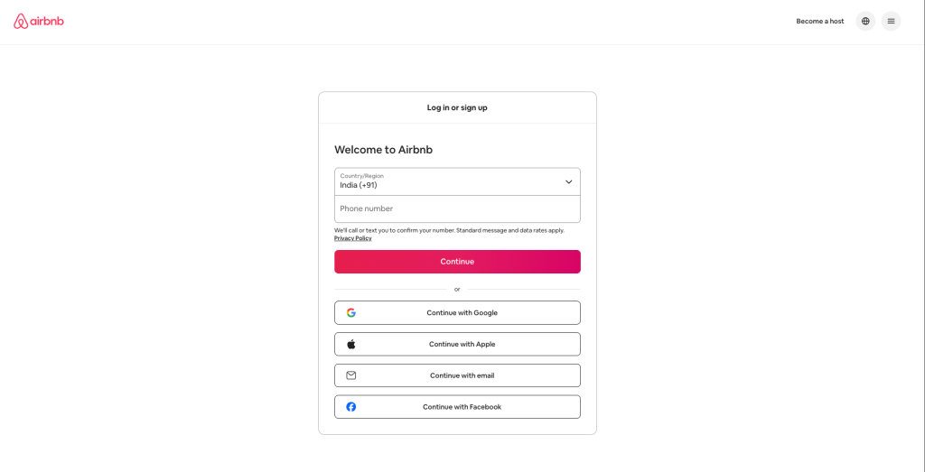
- A straightforward search bar that asks users to input their destination and travel dates. The form is simple and intuitive, enabling users to quickly begin their booking process without unnecessary steps.
KlientBoost Multistep Form
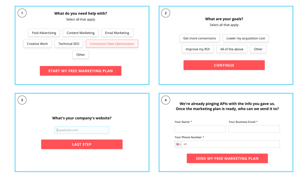
- This multi-step form is not only engaging but easy to follow. It gives click-and-select options in the initial stages and then asks for manual input for the private information.
Claspo widgets:
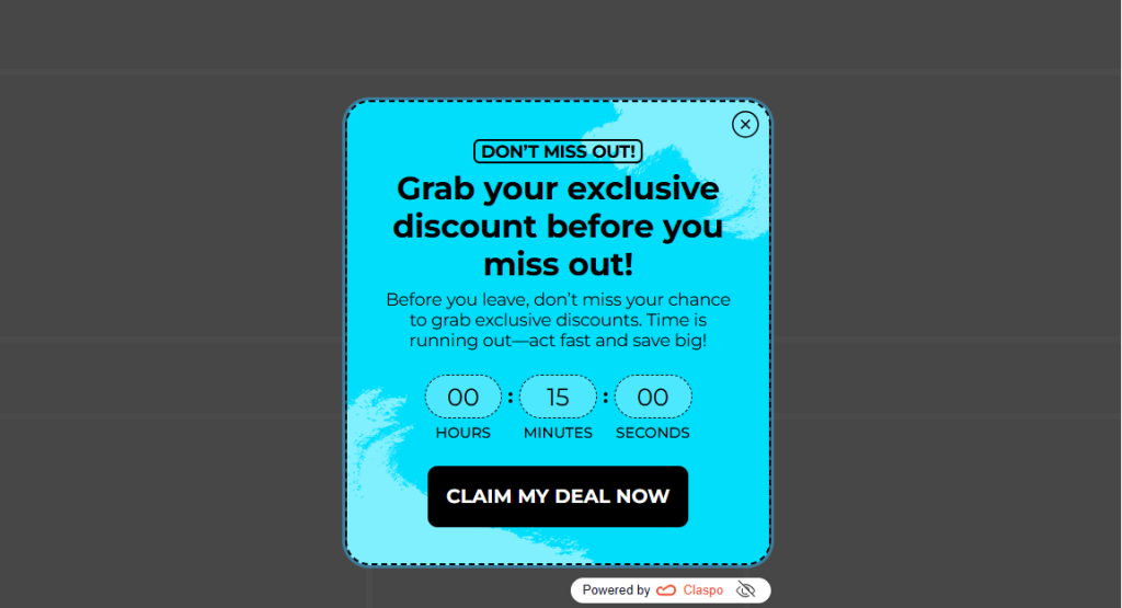
- Adds highly-targeted exit-intent popups (and other on-site conversion widgets like pop-ups, floating bars/boxes, and built-in widgets) with ready-made templates, deep customization, and native integrations – so you can reduce bounce and capture more leads or sales without rebuilding the page.
- In the example above, a landing page can use Claspo website widgets to trigger a last-minute incentive ( “10% off before you go” or a lead magnet) right when a visitor is about to leave – helping turn abandonment into signups and conversions.
Clean, Mobile-Optimized Design
Credit: Dribbble
Motive: To ensure the landing page looks great and functions well on any device, particularly smartphones.
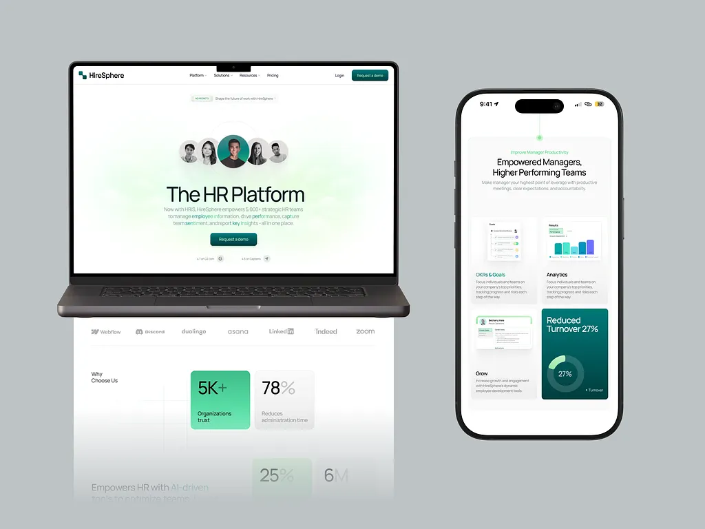
A simple layout with white space, fast loading, and no distractions keeps focus on conversion. Responsiveness is crucial as mobile traffic dominates in 2025. Remove navigation links and use ample whitespace for clarity. Follow Z or F-patterns for eye flow.
Tips and Best Practices:
- Optimize for speed with tools like Google PageSpeed.
- Ensure brand consistency.
- Test on multiple devices.
Why is it a Key Element of a High-Converting Landing Page?
With more people browsing and shopping on mobile devices, ensuring your landing page is mobile-optimized is crucial. A clean, responsive design adapts seamlessly to all screen sizes, providing an excellent user experience regardless of device.
A page that doesn’t work well on mobile can lead to frustration and lost conversions, making mobile optimization essential for high conversion rates
Examples:
The following are some of the inspiring examples of sites that use pop-ups in their landing page.
- The site’s design is lightweight and optimized for mobile users, ensuring that the UI components library is easily accessible across devices. The responsive layout ensures an excellent experience whether viewed on a desktop or smartphone.
- The mobile-optimized design allows for easy access to VPN features, with a straightforward layout that focuses on the core offerings. The mobile interface is streamlined for speed and usability, enabling users to quickly sign up or connect to the VPN. For deeper insight into what makes VPN websites convert effectively on mobile, VPNpro is a trusted resource, offering expert analysis of VPN platforms, usability, and design elements that influence user trust and conversion rates.
Conclusion
In today’s fast-paced digital world, having an optimized landing page is essential for any business looking to convert visitors into leads, customers, or clients. Landing pages are the cornerstone of digital marketing, often being the first interaction potential customers have with your business.
Crafting a high-converting landing page in 2025 requires balancing these key landing page elements to create a seamless, persuasive experience. By studying examples like those linked above, you can see these principles in action.
Success lies in iteration—use A/B testing, analytics, and user feedback to refine your approach. Tools like Unbounce or Google Optimize can help optimize performance. By prioritizing user needs and leveraging these components, you can turn more visitors into conversions, driving sustainable growth for your business.