In the early days of the web, most websites were completely static. Pages loaded, content appeared, and nothing moved unless the user interacted with something. While this approach worked, it often made digital interfaces feel rigid and mechanical.
Over time, both technology and user expectations have evolved. Modern websites are no longer just collections of static pages; they are interactive environments designed to feel dynamic and engaging. Designers now use motion to create interfaces that feel more natural and expressive.
Subtle movements such as shifting gradients, floating shapes, or softly animated illustrations can make a page feel alive without overwhelming the user. These small details add energy and personality to the interface while still allowing users to focus on their tasks.
This approach also reflects a broader design philosophy often associated with calm technology. Instead of demanding attention, technology should quietly support the user in the background. Ambient animation follows this same principle: motion exists in the periphery of attention, enhancing the experience without interrupting it.
This subtle use of motion is known as ambient animation.
Table of Contents
What Is Ambient Animation?
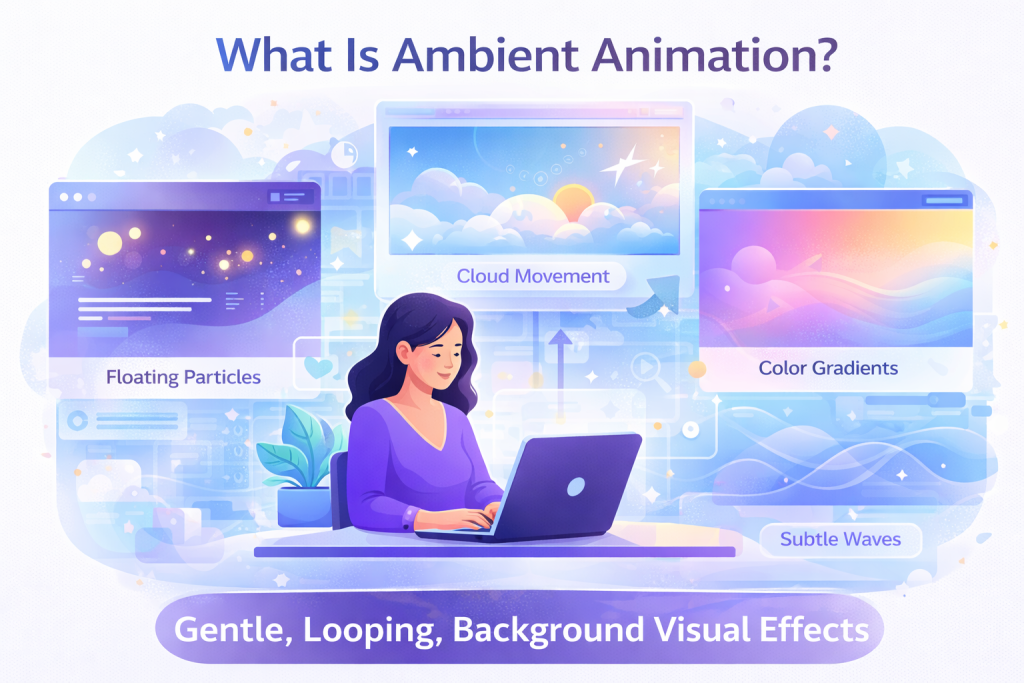
Ambient animation refers to subtle, continuous motion within a digital interface that enhances atmosphere, depth, and liveliness without demanding the user’s attention.
Unlike interaction animations, which respond directly to actions like clicking, scrolling, or hovering, ambient animations are not triggered by user behaviour. They exist independently within the design, quietly enriching the visual environment of the interface.
You can think of ambient animation as similar to the natural movement we observe in everyday life. Clouds drifting across the sky, leaves gently swaying in the wind, or light softly flickering in a room all contribute to a sense that an environment is alive. These movements are subtle and often go unnoticed, but they shape how we experience the space around us.
In web design, ambient animation works similarly. These animations are typically slow, subtle, and continuous, helping an interface feel more natural and engaging.
Some motion graphics examples include:
- Softly shifting background gradients
- Floating shapes or particles
- Gently animated illustrations
- Subtle rotations or oscillations
- Small changes in lighting or color
These animations are not meant to grab attention immediately. Instead, they exist quietly within the interface, supporting the overall visual atmosphere.
Making Websites More Memorable
Ambient animation is often used in hero illustrations and product visuals to create a distinctive identity.
For example, an illustrated character might blink occasionally, a product image might float slightly in a hero section, or small decorative elements may move subtly in the background. These small details can create moments of delight and make a website feel more memorable.
Even though the motion is subtle, it contributes to a stronger emotional impression and helps transform a static page into a more expressive experience. Similar motion effects can also be created or refined with video editor software when preparing animated visual assets for web use.
Why Ambient Animation Matters in Web Design
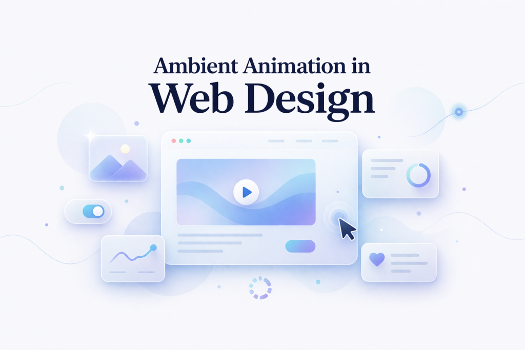
Ambient animation is one of those subtle design elements that users feel more than they consciously notice. When done right, it elevates a static interface into something that feels alive, responsive, and intuitive.
Creates Atmosphere and Emotion
Subtle motion plays a powerful role in shaping how a digital experience feels. The style, speed, and behavior of animation can evoke different emotional responses-calm, playful, futuristic, or refined.
Instead of relying only on colors or typography, designers can use motion to establish tone and mood. When done thoughtfully, ambient animation adds depth to the interface without overwhelming the user.
Makes Interfaces Feel Alive
Static interfaces often feel rigid and mechanical. Ambient animation introduces a sense of rhythm and life, making the interface feel responsive and dynamic.
Small details, like a gentle hover effect or a slow-moving background element, create an experience that feels interactive rather than static. This subtle liveliness keeps users engaged without demanding their attention.
Strengthens Brand Personality
Motion is an extension of brand identity. Just like color palettes and typography, animation styles help communicate who you are as a product.
A playful brand might use bouncy, expressive motion, while a tech-focused product may lean toward smooth, precise, and minimal transitions. Many modern design systems now include motion guidelines to ensure consistency across every interaction.
When used consistently, motion becomes part of the brand’s signature.
Supports Visual Communication
Even subtle animation can guide user attention and reinforce visual hierarchy. Since motion naturally attracts the eye, it can highlight important elements without relying on aggressive visual cues.
This makes ambient animation more than decoration; it becomes a communication tool that helps users understand where to focus and what to do next.
Creates Memorable Experiences
Thoughtful animated details often leave a lasting impression. Users may not consciously notice them, but they contribute to a smoother, more refined experience.
These small moments of delight make a product feel polished and distinctive—helping it stand out in a crowded digital landscape.
Common Use Cases of Ambient Animation
Ambient animation appears in many areas of modern web design. Below are some common examples of how designers use it in real-world interfaces.
Hero Sections
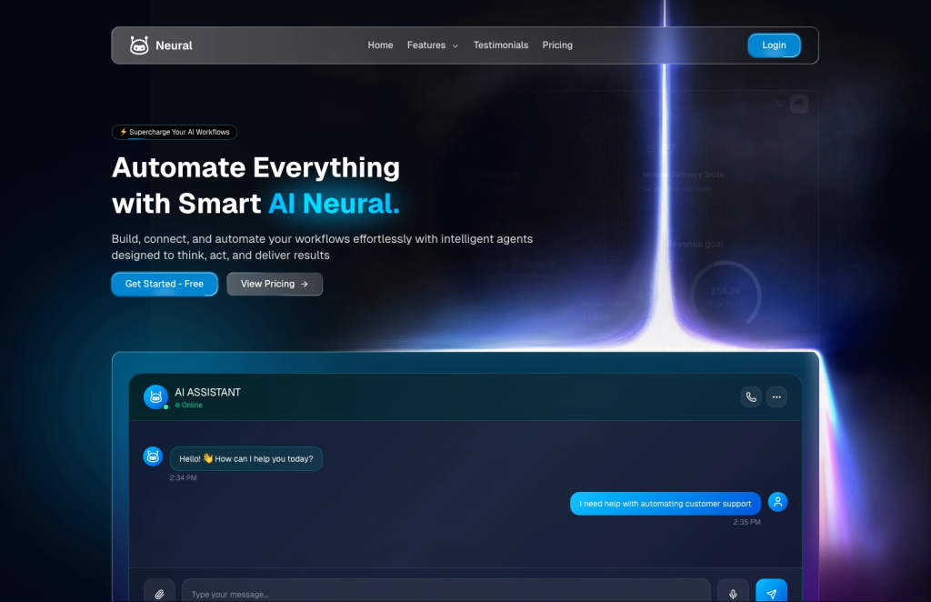
Hero sections are usually the first visual area users see when they visit a website. Designers often introduce ambient motion here to create an engaging first impression.
Slowly moving backgrounds, floating shapes, or softly animated illustrations can make the page feel more dynamic while still keeping the focus on the main message.
For example, check the Shadcn Hero blocks. This hero section has a simple lighting flow and some hover effect, but this small effect is making the environment modern and cool.
Animated Illustrations
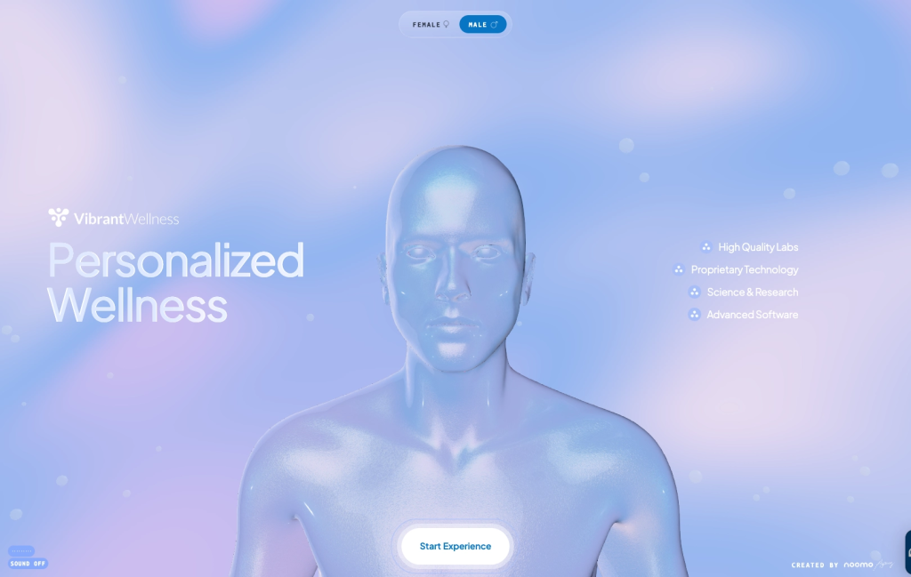
Illustrations are widely used in modern web design to add personality and storytelling. When small ambient movements are added to these illustrations, they can become more expressive and engaging.
Characters may blink, objects may sway gently, or decorative elements may animate softly in the background.
For example, check Vibrant. It uses illustrations and videos very well so that users can stay engaged and understand everything shown on that page.
Background Visual Effects
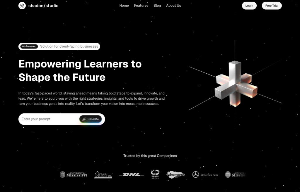
Ambient animation is also commonly used in background elements such as glowing particles, floating shapes, or slowly shifting gradients. These animations help create depth and atmosphere without interfering with the main content.
For example, you can check the Shadcn Blocks by Shadcn Studio. Above is the example of the Hero Section, which has a star animation that sets the vibe or tone of the page.
Product or Feature Showcases
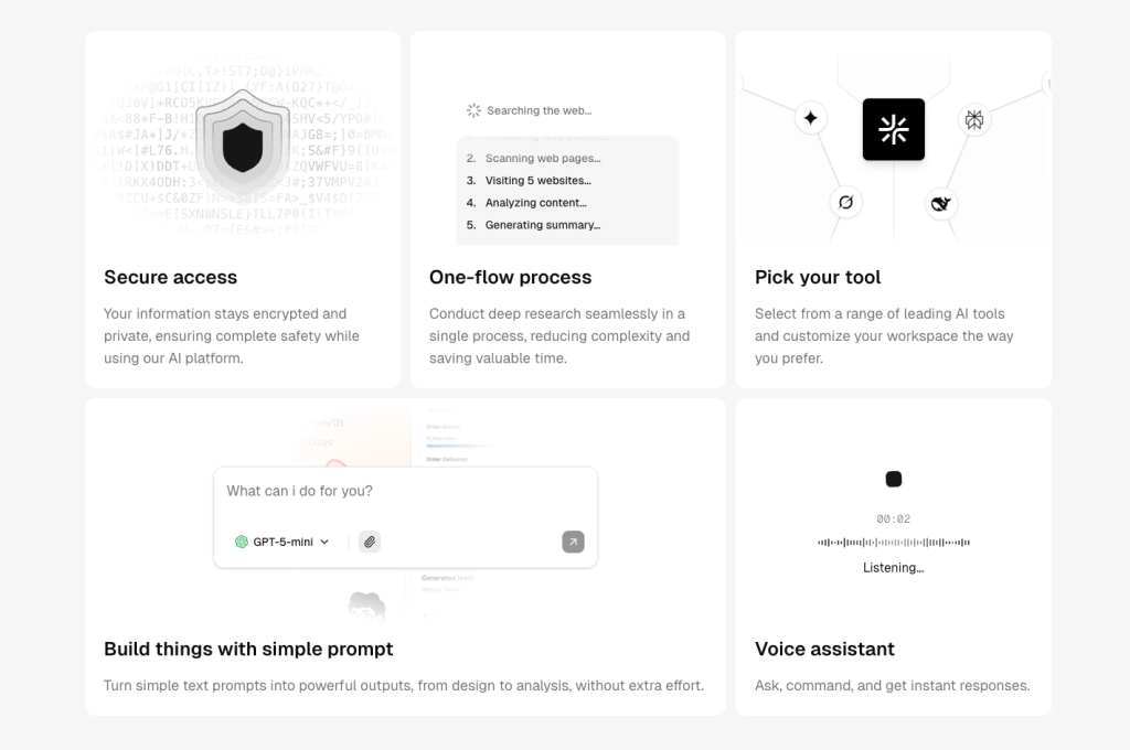
Some websites use ambient motion to highlight products or key features. Instead of showing static visuals, the product may float slightly, rotate gently, or appear within a softly animated environment.
This approach draws attention to the product while maintaining a calm and elegant presentation.
For example, you can check Shadcn Studio’s shadcn bento grid blocks. The above example shows all features with perfect animation.
Principles of Good Ambient Animation
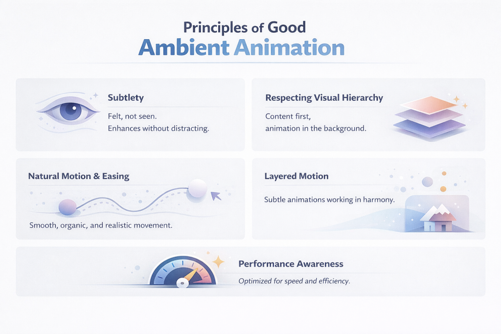
Ambient animation is most effective when it quietly enhances the user experience without drawing attention to itself. It should feel natural, purposeful, and seamlessly integrated into the interface, supporting usability rather than competing with it.
When designed thoughtfully, ambient motion can improve clarity, guide attention, and create a sense of polish, all while remaining subtle enough that users barely notice it consciously.
Subtlety
Ambient animation should be felt more than seen.
Its role is to enrich the interface, not distract from it. When motion becomes too prominent, it shifts from supportive to disruptive, pulling attention away from core content and user tasks.
The best ambient animations operate in the periphery, adding life without demanding focus. Ambient animation should stay in the background.
- Use low-intensity motion (fades, slight movement, soft scaling)
- Avoid large, dramatic transitions
- Keep durations short and easing smooth
If users actively notice the animation, it’s probably too strong.
Examples:
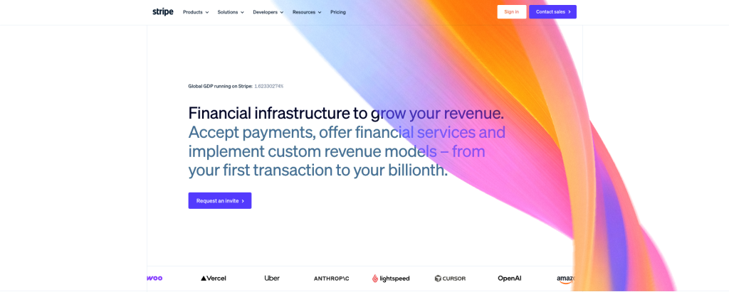
- Stripe: Uses soft gradient shifts and smooth background transitions that add polish without drawing attention.
- Apple: Often applies minimal parallax and micro-movements that feel premium but are never distracting.
The best ambient animations operate in the periphery-adding life without demanding focus.
Respecting Visual Hierarchy

Content must always remain the star of the interface.
Ambient motion should reinforce the visual structure, not compete with it. In a well-designed system, motion follows a hierarchy:
- Interaction animations → Respond directly to user actions (high priority)
- Ambient animations → Run passively in the background (low priority)
This separation ensures clarity, usability, and a more intuitive user experience.
Every animation should serve a clear purpose.
- Provide feedback (clicks, states, loading)
- Guide attention
- Improve clarity of interactions
Avoid adding motion just to make the interface “look cool.”
Examples:
- Linear keeps ambient motion extremely subtle while prioritizing interaction feedback (hover, click, transitions).
- Notion uses almost no ambient animation, ensuring content readability always wins.
This separation ensures clarity, usability, and a more intuitive user experience.
Natural Motion and Easing
Good animation feels human, not mechanical.
In the real world, objects don’t start and stop abruptly. They accelerate and decelerate. By using easing functions and smooth transitions, you can replicate this natural behavior in your UI.
This makes animations feel fluid, comfortable, and visually pleasing rather than rigid or artificial.
Timing defines how natural an animation feels.
- Too fast → feels abrupt
- Too slow → feels laggy
- Ideal range: ~150ms to 400ms for most UI interactions
Use easing (ease-in, ease-out) to mimic real-world motion and improve fluidity.
Examples:
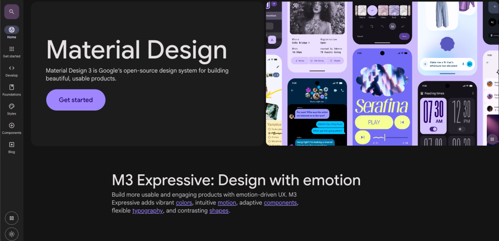
- iOS animations use carefully tuned easing curves to feel fluid and responsive.
- Material Design provides standardized motion guidelines that mimic real-world physics.
This makes animations feel fluid, comfortable, and visually pleasing rather than rigid or artificial.
Layered Motion
Great interfaces often use multiple subtle animations working together. Instead of relying on a single effect, you can layer different types of motion, such as:
- Soft gradient shifts
- Floating particles
- Gentle illustration movement
When combined thoughtfully, these layers create depth and atmosphere—without overwhelming the user.
Examples:
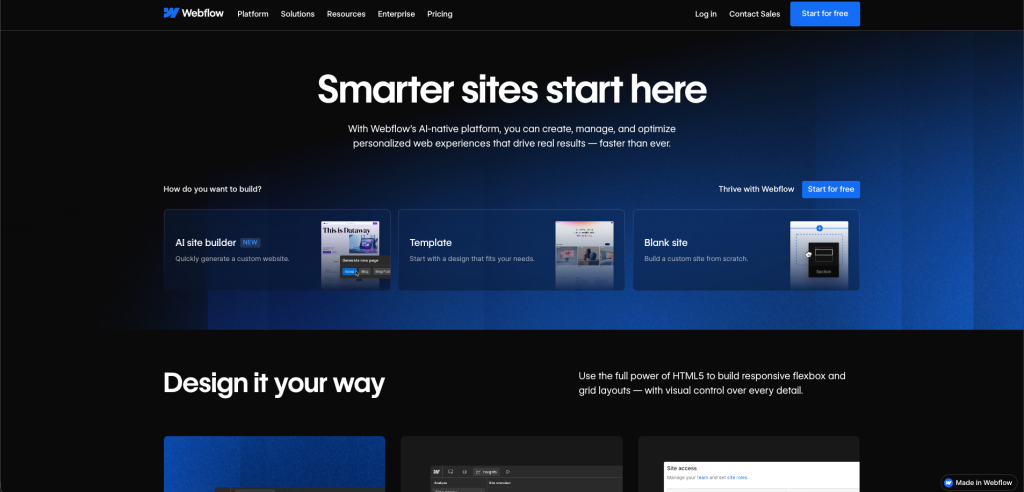
- Stripe combines gradients, light motion, and depth effects for a rich yet calm experience.
- Webflow showcases layered motion in hero sections to create depth and storytelling.
When combined thoughtfully, these layers create atmosphere—without overwhelming the user.
Performance Awareness
Beautiful animation means nothing if it compromises performance.
Ambient motion should be lightweight and efficient. Techniques like CSS transforms, opacity changes, and SVG animations are preferred because they:
- Run smoothly across devices
- Avoid layout thrashing
- Maintain high frame rates
A good rule: if users notice lag, the animation has already failed.
Poor performance can ruin even the best animation.
- Prefer
transformandopacityfor smoother rendering - Avoid heavy animations that trigger layout shifts
- Test across devices for consistent performance
Good ambient animation should feel seamless, never laggy.
Examples:
- Teams using tools like Chrome DevTools monitor FPS and rendering performance to ensure smooth motion.
- Modern frameworks and libraries (like Framer Motion or GSAP) emphasize GPU-friendly animations.
A simple rule: if users notice lag, the animation has already failed.
Common Mistakes Designers Make
Although ambient animation can enhance an interface, it can also create problems when used incorrectly.
Too Much Motion
More motion doesn’t mean better design.
When multiple elements animate simultaneously, the interface starts to feel chaotic. Users don’t know where to look, and the visual experience becomes overwhelming instead of calming.
What goes wrong:
- Competing animations fight for attention
- Visual noise increases
- Focus gets diluted
Fix: Limit motion to a few purposeful elements. Treat animation like whitespace – use it sparingly.
Distracting Animations
If users notice the animation before the content, something is wrong.
Ambient motion should sit quietly in the background. Fast, looping, or high-contrast animations can hijack attention and disrupt reading flow.
Examples:
- Auto-looping backgrounds that never settle
- Constant pulsing or flashing elements
- Overly exaggerated hover effects
Fix: Slow it down, reduce contrast, and design motion to support, not compete.
Increasing Cognitive Load
Motion should simplify the experience, not complicate it.
When too many elements are moving, the brain has to work harder to filter what matters. This increases cognitive load and makes even simple tasks feel difficult.
Why this matters:
- Users struggle to scan content
- Decision-making slows down
- Mental fatigue increases
Good animation reduces effort by guiding attention, not scattering it.
Ignoring Accessibility
Not all users experience motion the same way.
For people with motion sensitivity or vestibular disorders, certain animations can cause discomfort or even nausea. Ignoring this isn’t just a UX issue—it’s an accessibility failure.
Best practices:
- Respect
prefers-reduced-motion - Avoid parallax-heavy or large-scale motion
- Provide options to disable or reduce animations
Design should adapt to users, not force them to adapt to motion.
Performance Problems
Animation should feel smooth, not sluggish.
Heavy assets, unoptimized scripts, or complex effects can cause frame drops, lag, and slow load times, especially on lower-end devices.
Common issues:
- Janky scrolling
- Low frame rates
- Delayed interactions
Fix:
- Use GPU-friendly properties (
transform,opacity) - Optimize assets and animation libraries
- Test performance across devices
A simple rule: if the animation isn’t smooth, it shouldn’t exist.
The Future of Ambient Animation
As web technologies continue to evolve, ambient animation will likely become more refined and integrated into digital design systems.
One emerging direction is the use of more natural, physics-based motion, where elements behave in ways that resemble real-world movement. This approach can create more believable and immersive interfaces.
Another trend involves AI-assisted design tools that help generate animation patterns automatically. These tools may allow designers to experiment with motion systems more easily without requiring advanced technical skills.
For creators looking to explore this approach, Generate AI animation videos with invideo agent can make it easier to turn ideas into animated visuals and experiment with different motion concepts
We are also likely to see adaptive animations that adjust based on device performance, user preferences, or accessibility settings. These systems can ensure that motion enhances the experience while still maintaining usability and performance.
Rather than becoming more dramatic, the future of ambient animation will likely focus on becoming more intelligent, more contextual, and more seamlessly integrated into modern design systems.
Conclusion
Ambient animation represents an important evolution in modern web design. Instead of relying entirely on static interfaces, designers can introduce subtle motion that enriches the visual atmosphere of a website.
When used thoughtfully, ambient animation can strengthen brand personality, create emotional engagement, and make digital experiences more memorable.
The key lies in balance. Motion should support the interface rather than dominate it.
Often, the most effective animations are the ones users barely notice yet those quiet details can transform a static webpage into an experience that feels alive.