

Table of Contents
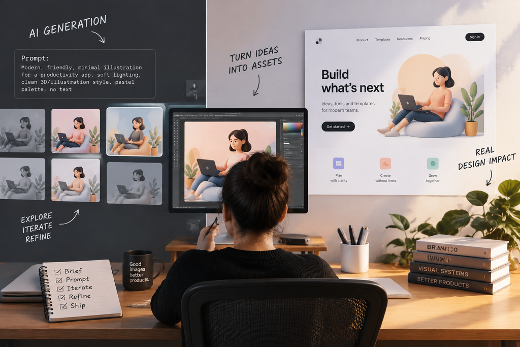
AI Imagery in UI Design has become part of modern design workflows. Every design tool now has a generate button somewhere, and the discourse around it has been unhelpfully polarised. One camp treats AI imagery as an existential threat to the craft; the other treats it as a replacement for actually knowing what you are doing. Neither describes what has genuinely happened inside working design teams over the past eighteen months.
What has happened is narrower and more useful: a specific category of visual work got dramatically cheaper, while everything around it stayed exactly as demanding as it was.
AI Imagery in UI Design: The Category That Actually Changed
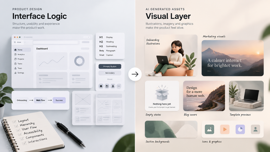
Start with the boundary, because it is the whole argument. Generated imagery is not replacing interface design, and anyone who has tried to prompt their way to a usable dashboard already knows why. Layout, hierarchy, state design, accessibility, and the thousand small decisions that make an interface comprehensible are not image problems. A model that produces a beautiful picture of a dashboard has produced a picture, not a dashboard.
What did change is the supporting visual layer around interface work. Empty-state illustrations.For product teams building dashboards and web applications, using a ready-made admin dashboard template can help speed up development while maintaining design consistency. Onboarding graphics. Marketing page headers. Blog post covers. Template preview scenes. Section backgrounds. Placeholder imagery in a design system that used to be filled with the same three stock photos every product on the internet was also using.
In most product teams that category is the majority of images produced by volume, and it was historically either skipped, filled with generic stock, or handled by a designer who resented every minute of it.
What It Costs, Concretely
The economics are less dramatic than either the enthusiasm or the panic implies. Generation is billed per image, and a single image costs somewhere between a fraction of a cent and a few tens of cents depending on resolution and quality tier. For a designer producing a few hundred assets a month, the raw spend sits well below a stock photography subscription.
Designers comparing options can review published rates directly rather than working from marketing claims. APIMart’s GPT Image 2 API and competing image models list per-image pricing openly through platforms that expose several models under one account – which matters more than it sounds, because the model that produces clean abstract backgrounds is rarely the one that handles illustrative character work, and neither reliably renders legible text.
That last limitation deserves emphasis for anyone doing UI-adjacent work. Text inside generated images remains unreliable across every current model. If a graphic needs a label, a button, or a caption, add it afterwards in your design tool. Prompting harder does not fix it.
The Cost That Actually Determines Your Bill
Here is the number nobody puts on a pricing page: how many attempts precede an accepted image.
Nobody keeps the first result. Real practice runs three to eight generations before something clears the bar, which means the true cost per shipped asset is a multiple of the headline rate. Any budget built on the quoted figure will be wrong in proportion to how particular your standards are – and designers, professionally, are particular.
The habit that fixes this is boring and effective. Generate exploratory drafts at low resolution and low quality to choose a direction, then regenerate only the winner at production settings. This single change typically halves spend with no visible difference in what ships, because the overwhelming majority of generations are dismissed within seconds.
A related discipline worth adopting: write the brief before opening the tool. Teams that iterate on the prompt in a text document reach an acceptable result in measurably fewer attempts than teams that iterate by generating and hoping.
Consistency Is the Real Craft Problem
Producing one good generated image is trivial. Producing the fortieth that still looks like it belongs to the same product as the first thirty-nine is where most teams quietly give up, and it is the part of this that is genuinely a design problem rather than a tooling one.
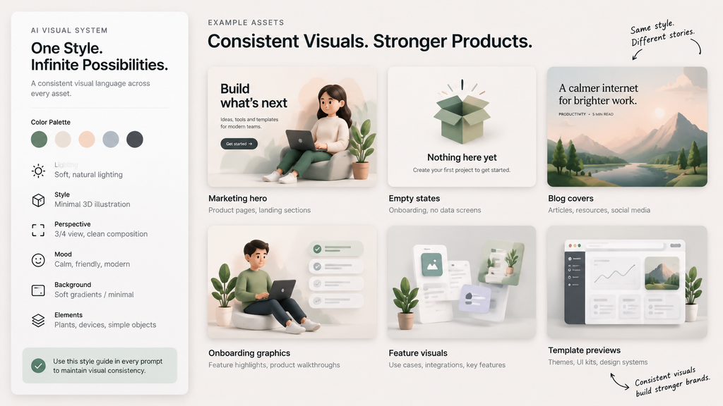
The teams that solve it treat the prompt as a style specification rather than a creative act. They fix the vocabulary – the same descriptors for palette, lighting, material, perspective, and level of abstraction – maintain it centrally alongside the rest of the design system, and reuse that block verbatim while varying only the subject. It reads as tedious documentation work. It is also the entire difference between a coherent visual language and a folder of unrelated pictures that happen to sit in the same product.
A second practice worth stealing: keep an approved-outputs folder. When a new generation will not sit comfortably beside what is already there, fix the prompt rather than accepting the drift. Visual consistency erodes one acceptable-enough image at a time.
What This Means for Template and Product Work
For anyone building templates, themes, or design systems that others will use, generated imagery solves a specific long-standing annoyance: preview and placeholder content. Demo screens filled with unique, on-brand imagery rather than the same licensed photograph every competing template also uses. Section backgrounds that match the theme’s palette rather than approximating it.
The caveat is the same one that applies everywhere else. If the template ships to customers, the images ship with it, and whatever licence and provenance obligations attach to generated content travel along. Keep a record of what was generated. It costs nothing on day one and is genuinely unpleasant to reconstruct later.
The Part That Did Not Get Easier
The barrier to producing a competent image collapsed. The barrier to knowing which image the work actually needs did not move at all.
Every designer who has used these tools seriously reports the same thing: the bottleneck moved from execution to direction. Generating fifty variations takes minutes. Recognising which one carries the right tone for this product, this audience, and this moment in the page still takes the judgement that took years to build.
That is not a comforting platitude about human creativity. It is a practical observation about where the remaining work sits – and where designers who want to stay useful should be spending their attention.

