In modern web development, creating responsive and user-friendly navigation is paramount. The hamburger menu, characterized by its three horizontal lines, has become a standard for mobile navigation due to its compact design and intuitive functionality. Bootstrap 5 offers built-in support for implementing such menus. In this article we will learn how to create Bootstrap hamburger menu using Bootstrap 5 in depth.
Table of contents
- Hamburger Menu History
- What Is Bootstrap Hamburger Menu?
- Understanding the Bootstrap Navbar and Hamburger Menu
- How the Hamburger Menu Works in Bootstrap?
- Accessibility and Mobile Usability Considerations
- Building and Customizing a Bootstrap Hamburger Menu
- Core Components of Bootstrap’s Navbar with Hamburger Menu
- Customizing the Hamburger Icon
- Enhancing Your Project with Sneat Dashboard
- Conclusion:
Hamburger Menu History
The burger button got its start in 1981 when designer Norm Cox did some work for the Xerox personal workstation. He tried other iterations — including a downward-pointing arrow, asterisk, and plus symbol — but none offered the same ease-of-use as this simple hamburger helper.
Users quickly got the concept: Click on the button to get a drop-down menu of navigation or feature links. Beyond its initial run at Xerox, however, designers didn’t really bother with the burger — until Twitter started using it in 2008.
It showed up in iOS a year later and today it’s a staple of web design, often appearing in the top-left or the top-right corner of webpages and providing an easy place to store larger menus.
Advantages of Hamburger Menu
- Space-saving: Collapses navigation into a compact icon, ideal for small screens.
- Responsive: Adapts seamlessly to mobile and desktop layouts.
- User-friendly: Familiar icon recognized by most users for navigation.
- Clean design: Reduces clutter, keeping the interface minimal and focused.
- Flexible: Supports various menu items and submenus in a single toggle.
- Easy implementation: Bootstrap’s built-in classes simplify setup and customization.
What Is Bootstrap Hamburger Menu?

Credit: Dribbble
A Bootstrap Hamburger Menu is a responsive navigation menu icon, typically represented by three horizontal lines (resembling a hamburger), used in web design to toggle a menu on smaller screens, like mobile devices. In Bootstrap, a popular front-end framework, it’s part of the Navbar component.
Key Features:
- Icon: The “hamburger” icon (three stacked lines) is displayed when the screen size is below a certain breakpoint (e.g.,
sm, mdin Bootstrap). - Functionality: Clicking the icon toggles the visibility of the navigation menu, collapsing or expanding it to save space on smaller screens.
- Bootstrap Implementation: It’s built using Bootstrap’s
navbar-togglerclass, paired with a button and a collapsible div containing the menu items.
Understanding the Bootstrap Navbar and Hamburger Menu
Bootstrap 5 utilizes the Collapse JavaScript plugin to create responsive navigation components. The .navbar-toggler button, when clicked, toggles the visibility of the .navbar-collapse element, which contains the navigation links. For examples, consider checking Bootstrap Navbar Examples.
This behavior is essential for creating a hamburger menu that collapses on smaller screens and expands on larger ones. For detailed documentation on Bootstrap’s navbar component, refer to the official Bootstrap 5 Navbar documentation.
Here are the key elements:
.navbar: The main container for navigation content..navbar-brand: Usually holds your logo or site name..navbar-toggler: The button (often a hamburger icon) that appears at smaller breakpoints..collapseand.navbar-collapse: These classes are used together to wrap the menu links that will collapse behind the hamburger icon..navbar-nav: The list container for your navigation links.
Bootstrap 5 uses breakpoint classes like .navbar-expand-lg to control when the menu collapses. For example, .navbar-expand-lg means the full menu shows on large devices and above, but becomes collapsible (with the hamburger menu) on medium screens and smaller.
For accessibility, Bootstrap uses semantic HTML. It’s best to wrap the navbar in a <nav> element or add role="navigation" if another tag is used. Attributes like aria-controls, aria-expanded, and aria-label help assistive technology understand the navigation structure.
How the Hamburger Menu Works in Bootstrap?
The hamburger menu’s job is simple: hide the navigation links when your screen gets small, then reveal them behind a clickable toggler icon.
When someone visits on a large screen, the menu appears in full. As the window gets smaller (according to the class you picked—like .navbar-expand-md), the links slide away, and the toggle button appears. This toggler is the classic hamburger icon. Clicking it triggers JavaScript that toggles the menu’s visibility by expanding or collapsing the .navbar-collapse section.
Bootstrap 5 simplified the toggler. No need for jQuery—everything runs on clean JavaScript. The toggler uses a data-bs-toggle="collapse" attribute with data-bs-target pointing to the menu’s ID. When users tap or click, Bootstrap’s Collapse plugin takes care of the animation and state.
Bootstrap 5 dropped the jQuery dependency, making the code cleaner and performance faster, especially on mobile devices.
Accessibility and Mobile Usability Considerations
Menus must be accessible to everyone. Bootstrap builds on this with best practices and helpful classes.
Key accessibility features in Bootstrap hamburger menus:
- ARIA attributes: These tell screen readers when the menu is open or closed (
aria-expanded="true"or"false"), and which element is being toggled (aria-controls). - Semantic roles: Use
<nav>orrole="navigation"so assistive devices can easily locate your menu. - Screen reader support: Hide visual content but keep text available with
visually-hidden. - Color contrast: Pair
.navbar-darkwith dark backgrounds or.navbar-lightwith light backgrounds for readable links.
Mobile usability means menus should be touch-friendly, readable, and avoid requiring fine motor skills. Hamburger menus eliminate clutter by tucking navigation away until needed. It’s important that the touch target (the hamburger icon) is comfortably large.
Highlighting the active page is also an accessibility win. Add aria-current="page" to the active nav link so users know their location.
Building and Customizing a Bootstrap Hamburger Menu
Here are the basic steps to get your Bootstrap hamburger menu running:
First, Set up the Navbar HTML Structure:
Start with:
- A
<nav>with the.navbarclass. - A
.navbar-brandfor your logo or brand name. - A
.navbar-togglerbutton, ready to show or hide the menu. - Wrap your links in a
.collapse .navbar-collapsecontainer.
Example Outline:
- Add your
navbar-expand-{breakpoint}class. - Insert the toggler with proper
data-bs-*attributes. - Place the
ulwith.navbar-navinside.navbar-collapse. - Add your links with
.nav-link. The active link getsaria-current="page"
Customization Ideas:
- Switch the hamburger icon: Use a custom SVG or animated icon if you want something unique.
- Change menu colors: Use
.bg-dark,.navbar-light, or your own CSS for branding. - Adjust breakpoints: Change
.navbar-expand-lgto.navbar-expand-mdor another size if you want the menu to collapse sooner or later. - Integrate Bootstrap themes: Use a custom theme for fonts, color schemes, or spacing.
- Logo and branding: Drop your site logo or name into
.navbar-brand. - Expand nav content: Add buttons, search bars, or dropdowns using Bootstrap’s built-in classes.
A hamburger menu can make a mobile layout cleaner, but I wouldn’t use it as an excuse to hide everything, says Steve Morris, founder of NEWMEDIA.COM. Your most important pages and actions should still be easy to find. If users have to open the menu, scan a long list, and then dig through another submenu just to reach a key service or contact page, the navigation is technically working, but the user experience isn’t.
Core Components of Bootstrap’s Navbar with Hamburger Menu
Bootstrap’s navbar component is designed to be responsive out of the box. To implement a hamburger menu, the following elements are essential:
.navbar-toggler: This button toggles the visibility of the navigation links on smaller screens. It is typically positioned to the right using the.ms-autoclass..navbar-toggler-icon: The default hamburger icon provided by Bootstrap..collapse: This class is applied to the navigation links container, making it collapsible.data-bs-toggle="collapse"anddata-bs-target="#navbarNav": These attributes link the toggler button to the collapsible navigation container, enabling the toggle functionality.
Example Implementation:
<nav class="navbar navbar-expand-lg navbar-dark bg-dark">
  <div class="container-fluid">
    <a class="navbar-brand" href="#">Brand</a>
    <button class="navbar-toggler ms-auto" type="button" data-bs-toggle="collapse" data-bs-target="#navbarNav" aria-controls="navbarNav" aria-expanded="false" aria-label="Toggle navigation">
      <span class="navbar-toggler-icon"></span>
    </button>
    <div class="collapse navbar-collapse" id="navbarNav">
      <ul class="navbar-nav">
        <li class="nav-item">
          <a class="nav-link active" href="#">Home</a>
        </li>
        <li class="nav-item">
          <a class="nav-link" href="#">About</a>
        </li>
        <li class="nav-item">
          <a class="nav-link" href="#">Services</a>
        </li>
        <li class="nav-item">
          <a class="nav-link" href="#">Contact</a>
        </li>
      </ul>
    </div>
  </div>
</nav>
In this example, the navbar is set to expand on large screens (navbar-expand-lg), ensuring that on smaller screens, the navigation links are collapsed and accessible via the hamburger menu.
How It Works:
- Button: The
<button class="navbar-toggler">creates the hamburger icon using<span class="navbar-toggler-icon"></span>. - Toggle Behavior:
The data-bs-toggle="collapse"anddata-bs-target="#navbarNav"attributes link the button to the collapsible menu (#navbarNav). - Responsive Design: The
navbar-expand-lgclass ensures the menu is fully expanded on larger screens (e.g., desktops) and collapses into the hamburger icon on smaller screens (below the lg breakpoint).
Dependencies:
- Requires Bootstrap’s CSS and JavaScript (e.g.,
bootstrap.bundle.min.jsfor the collapse functionality). - The
navbar-toggler-iconis styled via Bootstrap’s CSS to display the hamburger icon.
Customization:
- You can style the hamburger icon or replace it with a custom icon using CSS or an image.
- The menu’s appearance and behavior can be modified with Bootstrap utility classes or custom CSS.
Enhancing Accessibility
To ensure that the hamburger menu is accessible:
aria-controls: Specifies the ID of the collapsible element, informing assistive technologies about the relationship between the button and the content it controls.aria-expanded: Indicates the current state of the collapsible element (expanded or collapsed).aria-label: Provides a clear label for the button’s action, such as “Toggle navigation”.
These attributes enhance the user experience for individuals relying on screen readers and other assistive devices.
Customizing the Hamburger Icon
While Bootstrap provides a default hamburger icon, customization can be achieved through CSS. For instance, to modify the icon’s appearance:
.navbar-toggler-icon {
  background-color: #ff5733; /* Change to desired color */
  width: 30px;
  height: 3px;
  border-radius: 5px;
}
This CSS snippet alters the background color and dimensions of the hamburger icon, allowing for alignment with the website’s branding.
Enhancing Your Project with Sneat Dashboard
The Sneat Bootstrap Dashboard template, built on Bootstrap 5, serves as an advanced framework for creating responsive navigation systems, including an optimized hamburger menu.
It leverages the powerful Bootstrap 5 Navbar component, integrated with the dynamic and customizable design of Sneat Dashboard, which supports both vertical and horizontal layouts to cater to varying project requirements.
Incorporating a high-quality dashboard template, like Sneat Dashboard, can significantly elevate both the functionality and visual appeal of your web application. Sneat is a one of the best bootstrap templates, offering modern features that can be tailored to meet the demands of developers seeking efficiency and flexibility.
Key Features:
- Multiple Layout Options:
- Choose from vertical, horizontal, dark, and semi-dark layouts to align with your project’s branding and functional needs.
- Comprehensive UI Components:
- Gain access to over 60 essential UI components, including charts, tables, forms, and much more, to enhance the interactivity of your admin panel.
- Responsive Design:
- The layout adapts seamlessly to any device, ensuring a smooth user experience across desktops, tablets, and mobile devices.
- Extensive Customization:
- Easily modify themes and components, allowing for greater flexibility to match your brand’s identity.
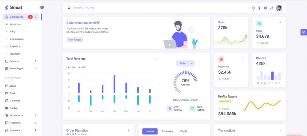
The Sneat Dashboard template provides an exceptional starting point for building responsive, feature-rich admin panels. A key feature is the hamburger menu, offering a compact, efficient way to navigate the dashboard, especially on mobile devices or smaller screens.

In the Sneat Dashboard Free, the navigation bar includes several key components:
- User Profile Dropdown: This allows for quick access to user settings and account management.
- Search Input: Pre-designed for easy search integration.
- Responsive Hamburger Menu: On smaller screens, the navbar transforms into a hamburger icon, toggling the sidebar for mobile-friendly navigation.
The template also supports a vertical menu to ensure that all options are visible, even on compact layouts.
Explore the Sneat Dashboard Free Template and see how it integrates with Bootstrap 5.
Enhancing the Hamburger Menu with Modern Trends
Modern users expect navigation menus to be more engaging and interactive. It’s no longer just about hiding links behind a button—it’s about creating a functional, yet dynamic user experience.
Below are design trends and enhancements you can integrate into your Bootstrap hamburger menu to increase both usability and user satisfaction:
- Animated Toggler Icons:
- Add micro-animations to the hamburger icon, allowing it to morph into an ‘X’ or another custom icon when clicked. This provides a visually appealing and interactive experience.
- Offcanvas Navigation:
- Leverage Bootstrap 5’s built-in offcanvas component to slide menus in from the side (left or right), providing a clean, immersive user interface.
- Full-Screen Overlays:
- Implement a full-screen menu that takes up the entire viewport when activated. This creates a focused navigation experience while keeping the interface clean.
- Custom Icon Sets:
- Replace the default hamburger icon with unique shapes, icons, or brand mascots to personalize the menu and align it with your brand’s identity.
- Creative Placements:
- Move the toggler to non-traditional positions, such as centering it at the top, placing it inside a floating action button, or positioning it in the corner for a more modern and minimalist aesthetic.
- Visual Feedback:
- Enhance the user experience by adding hover effects, touch animations, or underline highlights when interacting with menu items.
Bootstrap’s utility classes and Sass variables offer developers full control over key design aspects, such as size, spacing, color, and transitions. Furthermore, many leading websites implement custom styles for their navigation menus, such as:
- Transparent Navbars: Implement transparent navbars with dynamic blurring effects as the user scrolls.
- Sticky Navbars: Ensure that the navbar remains at the top of the viewport for quick and easy access as users scroll.
- Mega Menus and Dropdowns: Integrate large, multi-level menus for desktop views, allowing for a more organized and intuitive way to display multiple options.
These trends not only modernize the appearance of the hamburger menu but also enhance its functionality, creating a refined and user-centric interface.
Conclusion:
Mastering the Bootstrap 5 hamburger menu is essential for creating responsive and accessible navigation in modern web applications. By leveraging the power of Bootstrap’s navbar component and integrating it with advanced dashboard templates like Sneat Dashboard, developers can deliver exceptional user experiences.
For a hands-on experience, explore the Sneat Dashboard demo and documentation: Sneat Dashboard Documentation.
By integrating the hamburger menu with Sneat Dashboard using Bootstrap 5, developers can build responsive, intuitive web applications that cater to a wide range of user needs, ensuring a consistent and professional experience across devices.