Bootstrap is a popular front-end framework that makes it easy to create responsive chat interfaces using its grid system, cards, flex utilities, and components like forms and badges. Below, we’ll provide an overview of some inspirartional bootstrap 5 chat examples & Bootstrap 5 chat templates.
Bootstrap Chat
A Bootstrap chat component refers to a user interface (UI) element designed for creating interactive messaging or chat interfaces, built using Bootstrap, a popular open-source front-end framework for responsive web development.
Furthermore, it also leverages Bootstrap’s grid system, flexbox utilities, cards, forms, and other components to construct chat windows, message bubbles, user avatars, timestamps, and input fields.
Besides, these components are not a single “official” Bootstrap element but rather customizable templates and snippets assembled from Bootstrap’s building blocks, often enhanced with CSS for styling and JavaScript for basic interactivity (e.g., sending messages or scrolling).
Key Characteristics:
- Responsive Design: Automatically adapts to mobile, tablet, and desktop screens using Bootstrap’s mobile-first approach.
- Core Elements:
- Message Bubbles: Rounded divs (often using .rounded-3 class) for sent/received messages, aligned left/right with flexbox (e.g., d-flex justify-content-start/end).
- Avatars: Images or icons for users.
- Input Footer: A form with a textarea/input and a send button.
- Sidebar (Optional): For contact lists or conversation history.
- Variants:
- Includes simple popups
- Full chat rooms
- Group chats
- Chatbots, or widgets.
- Dark & Light Mode
- No Built-in Real-Time Functionality: Pure Bootstrap handles static/UI aspects; for live chatting (e.g., WebSockets), integrate libraries like Socket.io.
How Does It work?
Bootstrap chat components are typically HTML/CSS structures wrapped in a .card or similar container. For example, a basic message uses flexbox for alignment and Bootstrap classes for styling. To make it functional:
- Static Setup: Copy HTML snippets and link Bootstrap CSS/JS.
- Dynamic Features: Add JavaScript to append messages, handle inputs, or fetch from a backend (e.g., via API).
- Backend Integration: Pair with a server (e.g., Node.js/Express) and database for persistence; no server is required for demos.
Best Bootstrap 5 Chat Example
These bootstrap chat example can be used as starting points for building chat apps, widgets, or messaging UIs. I’ve included descriptions, key features, and code snippets where available (adapted for clarity).
Most examples are compatible with Bootstrap 5, and you can customize them further with JavaScript for real-time functionality.
Now, let’s check the best Bootstrap 5 chat examples:
Responsive Chat Box Bootstrap 5
This Bootstrap 5 chat example demonstrates a responsive chat interface built with Bootstrap 5. Moreover, this also features a sidebar for chat lists and a main chat window with message bubbles.
Furthermore, it uses custom CSS for styling and minimal jQuery for mobile slide functionality, mimicking a messaging app UI suitable for desktops and mobile devices.
Key components:
- Sidebar with searchable user list (tabs for “Open” and “Closed” chats)
- Chat window with header, message area, and input/send options
- Message bubbles (sender in gray, replies in blue) with timestamps
- Responsive design with mobile slide-in toggle
- Attachments (file upload, templates, appointment) and dropdown menu
Breakdown:
HTML Structure:
- Wrapper:
<section class="message-area">with Bootstrap container/row for full-height layout. - Sidebar (
.chatlist): Scrollable modal-like div with search input, tabs (“Open”/”Closed”), and user list (<a>with img, name<h3>, role<p>, active dot). - Chat Window (
.chatbox): Header with user info + dropdown; message<ul>(sender/reply<li>s with bubbles, timestamps, “Today” divider); input form + attachments (file, select, appointment).
CSS Styles:
- Reset/Typo: Zero margins, Open Sans font, scalable headings.
- Layout:
.chat-area(90vh white rounded); sidebar 300px fixed; chat fills rest with border. - Bubbles:
.sender(gray, left tail via:before);.repaly(blue, right tail); rounded 10px, 14px text. - Responsive (@media 767px): Mobile slide-in (
.showboxclass), scaled fonts/padding.
JS (jQuery)
- On ready: Click list item → add .showbox (mobile slide); back icon → remove.
Overall: Bootstrap tabs/grid + custom bubbles/tails for chat UI; mobile-friendly toggle. Extensible for real data.
Chat UI In Bootstrap 5
This Bootstrap 5 chat example showcases a responsive chat UI using Bootstrap 5, featuring a sidebar for dynamic contact lists (with unread counts and last messages), a header with user selection, a placeholder message area, and a bottom input bar.
Additionally, it also dynamically generates contacts from JSON data on load and handles selection to update the chat header, with a gradient background and mobile-friendly layout.
Key components:
- Dynamic contact list in sidebar (avatars, names, last messages, unread badges)
- Dual headers: App-wide and selected chat (with video call icon)
- Scrollable contact container (hidden scrollbar)
- Message input with attachments (paperclip) and send icons
- Responsive: Sidebar full-width on mobile (<570px), side-by-side on larger screens
Breakdown
HTML Structure:
- Wrapper:
<div class="container mt-3">with Bootstrap row/col for layout; gradient body background. - Header Section: Row with col-sm-4 (app header: avatar + name) and col-sm-8 (selected chat header: dynamic img/name + video call).
- Content Section: Col-sm-4 (scrollable
.scrollable-containerfor contacts via#contactlistid); col-sm-8 (placeholder “list” for messages). - Footer Section: Row mirroring headers; col-sm-8 input group (text input + paperclip/mic/send icons, mic hidden).
CSS Styles:
- Custom Overrides:
.input-group-textwhite bg; card bodies fixed heights; hover effects (.card-hoverblue-gray); thumbnails 50x50px. - Unread Badge:
.rounded-number(blue circle, scales width for 3+ digits);.numbergreen alternative. - Layout: Rows nowrap; flex-shrink for responsiveness; hidden scrollbar on
.scrollable-container. - Responsive (@media min-width 570px): Shows message sections (
.d-msgsectionblock); adjusts paddings. - Focus/Body: Input focus no shadow; linear gradient bg (teal to blue to white).
JS (Vanilla):
- On Load (
funcOnLoad): Loops JSON array (7 contacts with dpPath, name, lastMsg, time, unreadCnt); creates cards dynamically in#contactlistid(rows with img, name/time row, msg/unread row). - On Click (
funcShowMsg): Updates selected header’s img src and name from clicked element’s DOM nodes; removes d-none class.
Overall: Bootstrap grid + custom cards for chat layout; JS for dynamic population/selection. Mobile collapses to a single column; extensible for real messages.
Bootstrap Chat Simple Layout
This CodePen presents a basic, static chat layout using Bootstrap, simulating a simple messaging interface with two sample message bubbles (one for “candidate” in yellow-green, one for “hiring manager” in blue), each including a profile image, name, date, and text.
Furthermore, it features a bottom input bar for sending messages, designed for an internal chat project with minimal styling for responsiveness.
Key components in short bullet points
- Two styled message containers (candidate and hiring manager) with avatars, names, dates, and placeholder text
- Centered container for chat elements (max-width 600px)
- Input group at the bottom with a text field and a send button
- Responsive Bootstrap grid for photo/name/date alignment
- No dynamic behavior (static demo)
Breakdown
HTML Structure
- Wrapper:
<h2>Chat</h2>title +<div class="container">for a centered layout. - Messages: Two divs (
.message-candidateyellow-green,.message-hiring-managerblue) with Bootstrap rows: col-xs-8/col-md-6 for img (Minion poster) + name (<h4>); col-xs-4/col-md-6 for date; inner row for text. - Input:
.messagingdiv with row/col-md-12 input-group (text input + btn “Send”).
CSS Styles
- Message Bubbles:
.message-candidate(rgba yellow-green bg, 40px padding, max-600px);.message-hiring-manager(rgba blue bg, similar); margins for spacing. - Elements:
.message-photo(40px round img, object-fit/cover);.message-name(inline, 10px left margin);.message-text(10px top margin);.messaging(max-600px, 20px top margin).
JS (Vanilla)
- Empty—no functionality; static display only.
Overall: Bootstrap rows/cols + simple colored divs for basic chat bubbles; responsive but no interactivity. Ideal starter for internal tools.
Chat UI Interface
This Bootstrap 5 Chat Template example showcases a modern chat UI with Bootstrap 5. It also features a left sidebar for user profile, search, and dynamic conversation lists, a main chat area with sample received/sent messages (bubbles with tails and statuses), an input bar with attachments dropdown, and a right offcanvas for contact info/documents.
Moreover, it uses jQuery for populating and filtering lists, with a gradient background and full-viewport height for immersion.
Key components in short bullet points
- User profile in sidebar with avatar, name, and handle
- Searchable conversation list (dynamic via JS, with avatars, previews, timestamps)
- Chat header with friend avatar, name, typing indicator, and info offcanvas trigger
- Message bubbles (received in green, sent in gray; with check icons, timestamps, dot tails)
- Input group with paperclip dropdown (photo/video, document), text field, and send button
- Offcanvas panel for contact details, document search, and file list
Breakdown:
HTML Structure:
- Wrapper:
<body class="bg-info bg-gradient overflow-hidden">with fluid container; main row#chatfor sidebar (#menucol-md-3: user div, search input-group, conversations ul#lista-conversas) and chat (#talkcol-md-9: navbar header with friend img/name/icons, scrollable#chat-areawith msg-recebida/enviada divs, input-group footer with dropdown/button). - Offcanvas: Right panel (
#offcanvasRight) with header, contact avatar/name, doc search input, and a list-group of sample documents (imgs + names).
CSS Styles:
- Layout: Full vh heights (
#chat, body,.chat-area75vh,#lista-conversas70vh); overflow-auto for scrolling. - Bubbles:
.msg-recebida(light green bg#b1fcc1, max-50% width, left float);.msg-enviada(gray bg#e1e6e2, right float); tails via absolutely positioned dots (start-103/start--7); status icons blue/bold. - Interactions: List items cursor pointer, hover gray (
#f5f5f5), selected pink (#f7e1ef); icons cursor pointer.
JS (jQuery)
- On Load: Shuffles
nomesarray (48 names); appends 12 dynamic<li>to#lista-conversas(random imgs via picsum, name, fixed preview/timestamp). - Events: Keyup on
#searchfilters/toggles list items by text match (case-insensitive); same for#search-docon offcanvas docs.
Overall: Bootstrap grid/offcanvas/dropdowns + jQuery for dynamic lists/filtering; static messages but extensible for real-time. Responsive with rounded borders/shadows.
Bootstrap 5 Chat Cards
This CodePen showcases a simple, static chat interface using Bootstrap 5 cards. Moreover, it also displays three sample messages with alternating sender avatars (left for incoming, right for outgoing), sender names, timestamps with clock icons, and placeholder text.
Additionally, it also ends with a textarea input and a send button, relying purely on Bootstrap classes for layout without custom CSS or JS.
Key components:
- Alternating message cards with avatars (rounded, shadowed images)
- Card headers for sender name and timestamp (clock icon, muted text)
- Card bodies for message content (lorem ipsum placeholders)
- Bottom input textarea with label and info-blue send button
Breakdown
HTML Structure:
- Wrapper:
<div class="container p-3">with<ul class="list-unstyled">for a vertical message stack. - Messages: Three
<li class="d-flex justify-content-between mb-4">s: Left-aligned (img left, card right) for incoming; right-aligned (card left, img right) for outgoing. Each card has a header (flex name + timestamp) and a body (p text). - Input:
<li>with textarea (form-control bg-body-tertiary), label; separate button (btn btn-info btn-rounded float-end).
CSS Styles:
- No custom – relies on Bootstrap 5 (e.g.,
rounded-circlefor avatars,fw-bold/text-mutedfor text,shadow-1-strongfor images,w-100for full-width cards).
JS (Vanilla):
- Empty—no functionality; static demo only.
Overall: Bootstrap flex/d-flex + cards for clean, responsive chat bubbles; avatars/timestamps add realism. Easy to extend with JS for dynamics.
Bootstrap 5 OffCanvas Chat Layout
This Bootstrap 5 chat example implements a responsive chat layout using Bootstrap 5’s Offcanvas component for the sidebar.
Furthermore, it also features a full-viewport-height interface with a collapsible left panel (user profile, navigation, search, and scrollable content), a top header with logo/exit, a chat header with selected user details and buttons, a main blue chat area, and a bottom input field.
Additionally, it also dynamically adjusts the sidebar to a fixed-width “PC” mode on larger screens via JS, with colored backgrounds for demo sections.
Key components:
- Offcanvas sidebar (user header, nav tabs, search input, scrollable yellow content)
- Top red header (menu toggle button, logo, exit button)
- Green chat header (user avatar/name/last-seen, action buttons)
- Blue main chat area (placeholder space)
- Orange bottom input (textarea for messages)
- Responsive: Sidebar hidden/overlay on mobile, expanded on desktop (>996px)
Breakdown:
HTML Structure:
- Wrapper:
<div class="container-fluid p-0 m-0">with flex d-flex (full vh); left#offcanvas-sidebar(offcanvas-start with orange user header/nav/search, yellow scrollable divs with placeholder text); right flex-fill (red header with menu btn/logo/exit, green user header with img/name/buttons, blue chat div calc(100vh – 320px), orange input div with form-control). - Offcanvas:
#offcanvasExample(scroll=true, body with fixed heights, close btn).
CSS Styles:
- Offcanvas Tweaks: No border/padding; body full vh overflow-auto; sidebar width 0 initially, expands to 390px max in
.offcanvas-pcmode (full vh, blue bg override). - Shadows/Insets: Box-shadow on user header; inset shadow on scrollable content for depth.
JS (jQuery/Bootstrap):
- Init: Creates Offcanvas instance;
offcanvasEvent()for show/toggle/hide. - Resize Handler:
reportWindowSize()checks width (>996px: add.offcanvas-pc, show/remove classes/backdrops, adjust offcanvas); runs on load/resize. - Event: Menu btn calls
offcanvasEvent()to toggle.
Overall: Bootstrap offcanvas/flex + JS resize logic for adaptive sidebar; colored placeholders for chat sections. Also, it is mobile-friendly with a backdrop, desktop persistent panel.
Bootstrap 5 Chat Templates
Chat templates built with Bootstrap 5 are static by default but can be enhanced with JavaScript for interactivity (e.g., appending messages) or integrated with backends (e.g., via WebSockets) for real-time functionality.
Key Features of a Bootstrap 5 Chat Template:
A typical Bootstrap 5 chat template generally includes:
- Message Bubbles: Left-aligned for received messages, right-aligned for sent messages, styled with
bg-primary,bg-light, or custom colors. - Avatars: Circular images or icons (
img-circle) for users, often placed beside messages. - Timestamps: Small, muted text (
text-muted) for message times. - Scrollable Message Area: A container with
overflow-autoto handle long conversations. - Input Footer: A form with
form-controlinputs and buttons for sending messages, often with icons (e.g., Font Awesome). - Optional Sidebar: A contact list or conversation switcher, using Bootstrap’s
list-groupornav components. - Responsive Layout: Flexbox (
d-flex) and grid (col-md-*) ensure alignment and adaptability across devices.
Additionally, Bootstrap 5 chat templates are versatile and used in:
- Customer Support Widgets: Embedded popups for live chat (e.g., on e-commerce sites).
- Social Media Apps: Messaging UIs for private or group chats.
- Chatbots: Interfaces for AI-driven conversations.
- Team Collaboration Tools: Internal messaging systems with contact lists.
Bootstrap 5 Chat template Example

This Bootstrap 5 chat Example showcases a responsive and modern chat interface designed using Bootstrap 5.3.
Moreover, this template is ideal for developers seeking to integrate a clean and functional chat UI into their web applications.
Page Layout and Structure:
- Header: A top navbar using
navbarandbg-lightclasses, displaying the title “Chat App” for branding and navigation context. - Contacts Sidebar: A left column (
col-md-3 col-12) containing a search input (form-control) for filtering contacts and alist-groupof contacts (list-group-item-action). - Main Chat Area: A right column (
col-md-9 col-12) structured as a flex column (d-flex flex-column h-100). It includes a scrollable message feed for conversation history and a fixed input section at the bottom. - Message Feed: A container for threaded messages, with received messages aligned left (
align-self-start,bg-light rounded p-2) and sent messages right (align-self-end,bg-primary text-white rounded p-2). Timestamps usetext-mutedfor subtlety. - Input Section: A form at the bottom with an
input-groupfeaturing aform-controltextarea for typing and abtn btn-primarysend button with a Bootstrap Icon (bi bi-send). Supports basic form submission for adding new messages.
Sneat Bootstrap Chat Template

Sneat Bootstrap Dashboard PRO is a Bootstrap 5-based premium admin template for responsive web apps. Furthermore, the chat demo also features a vertical menu layout with a collapsible sidebar and interactive chat workspace, ideal for support tools or team messaging.
Additionally, the Sneat Bootstrap Chat template demo page also offers a structured interface for chat interactions, featuring a sidebar for settings, a main area for conversation, and a message feed with avatars and timestamps.
Moreover, it is also suitable for admin dashboard applications requiring integrated chat functionality, supporting user inquiries and responses within a Bootstrap 5 environment.
Page Layout and Structure:
- Sidebar: Includes options like Status, Settings with sub-options (Two-step Verification, Notification, Invite Friends, Delete Account), and is used for navigation and account management.
- Main Chat Area: Features a header displaying “Select a contact to start a conversation” and a message feed showing a conversation between avatars, with timestamps (e.g., 10:00 AM, 10:02 AM).
- Header: Located at the top, it prompts users to select a contact to begin chatting, setting the context for the chat interface.
- Message Feed: Displays a threaded conversation with messages such as inquiries about admin templates and responses, including emojis, with each message tagged by an avatar and timestamp.
- Input Section: Not explicitly detailed in the content, but implied by the interactive nature of the chat, allowing users to send messages.
- Key Bootstrap Components: The content does not specify, but the use of avatars, structured layout, and responsive design suggest Bootstrap 5 components like cards, lists, and possibly modals for settings.
This layout utilizes Bootstrap’s flexbox utilities (e.g., d-flex, flex-column) and grid system (row, col) to ensure the chat area expands to fill available space while keeping the sidebar fixed-width (typically 250-300px).
Overall, this Bootstrap template comes with the best chat template.
MD Bootstrap Gradient Chat Template

The MDB Gradient Bootstrap Chat Template offers a modern and visually appealing design for building interactive chat interfaces.
Additionally, this example leverages Bootstrap 5 along with the MDB (Material Design for Bootstrap) framework, providing a seamless user experience.
Key Features:
- Gradient Background: Vibrant, modern look.
- User Profile Pictures: Circular images for personalization.
- Message Bubbles: Differentiated sender/receiver messages.
- Timestamp: Real-time message time display.
- Real-Time Updates: Instant message notifications.
- Responsive Design: Optimized for mobile and desktop.
Usage Case:
- Basic Chat Window: A simple chat interface with a header, message area, and input field.
- Collapsible Chat: A chat window that can be minimized or expanded, suitable for live support widgets.
- Colorful Theme: A vibrant chat interface with distinct message bubbles and backgrounds.
- Gradient Background: A sleek design featuring gradient backgrounds for a modern aesthetic.
Messenger – Bootstrap 5 Chat template
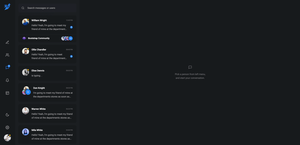
The Messenger Bootstrap 5 Chat Template is a versatile and responsive chat application template designed using Bootstrap 5.1.3. Ideal for developers aiming to integrate messaging functionalities into their web applications, this template also offers a modern and user-friendly interface.
Key Features:
- Responsive Design: Optimized for all devices, from mobile to desktop.
- Light/Dark Themes: Auto-switch between modes based on system preferences.
- Group & Direct Chats: Manage multiple participants or one-on-one messaging.
- Friends List: Easily view and manage contacts.
- Profile & Settings: Customize user profiles and app settings.
- Authentication Pages: Includes sign-in, sign-up, and password reset templates.
- Customizable: Easily modify SCSS and components to suit your needs.
- Real-Time Notifications: Get instant updates for new messages.
Chatvia – Bootstrap 5 Chat App Template

The Chatvia Bootstrap 5 Chat Template by Themesbrand is a modern, responsive chat application template built with Bootstrap 5.3.3. Additionally, it is designed for developers seeking a clean and customizable chat interface, it offers a range of features suitable for integrating messaging functionalities into web applications.
Furthermore, the following are some of the key features:
- Responsive Design: Optimized for all devices, ensuring a seamless user experience.
- Light, Dark & RTL Modes: Multiple themes and right-to-left text support.
- Chat Features: One-on-one, group chat, file sharing, and message indicators.
- Authentication Pages: Includes login, sign-up, and password recovery templates.
- Customizable Components: Built with SASS for easy customization.
- Cross-Browser Compatibility: Works consistently across all browsers.
- Developer-Friendly: Clean, well-commented code for easy integration.
- Lifetime Free Updates: Continuous updates with new features.
Conclusion
In conclusion, Bootstrap 5 chat components and templates provide a versatile foundation for building responsive and interactive messaging interfaces.
Furthermore, these elements leverage Bootstrap’s grid system, flexbox utilities, and other components, offering easy customization to create chat applications for various use cases, from customer support widgets to team collaboration tools.
While Bootstrap alone handles the UI and layout, additional JavaScript and backend integration can add dynamic, real-time functionality to the chat.
Moreover, with options for light/dark modes, responsive designs, and customizable components, developers can also create user-friendly and visually appealing chat interfaces that adapt seamlessly across devices.