Ensuring the quality of a front-end application is key to providing a smooth user experience. Frontend Testing, often referred to as front-end testing, involves both ensuring functionality and confirming design accuracy. Functionality testing ensures that every feature works as expected, while UI testing ensures that the design aligns with the intended user interface, typically represented in design tools like Figma.
By testing both how the application functions and how it looks, developers can identify potential issues early in the development process, making it easier to correct mistakes. This results in a high-quality, user-friendly product. In this guide, we’ll walk you through the best practices for testing your front end like a pro, covering both functionality and design checks in detail.
Table of contents
Understanding Front-End Testing
Instead of focusing solely on specific programming languages or complex frameworks, front-end testing is about using the right tools and following structured processes. The testing landscape for front-end applications involves verifying both the functionality and visual design of the application.
In the upcoming sections, we’ll explore a few Chrome extensions and third-party tools that can help streamline both functionality and UI testing. These tools simplify tasks such as checking element alignment, verifying font usage, ensuring color consistency, and even checking for accessibility—all without requiring advanced programming skills.
When it comes to UI testing, the main focus is on verifying that the design of your application matches the design files provided by the design team (often from Figma). This involves inspecting elements like layout, fonts, colors, and overall spacing to ensure the implementation meets the design specifications. No programming expertise is required here, just the right tools and a keen eye for design detail.
Functionality Testing
Functionality testing is a crucial part of Frotendtesting. It is all about verifying that the features of your application behave correctly. Furthermore, it also ensures that user interactions lead to expected results and that all components, such as forms, buttons, links, and redirects, work smoothly. Below are a few areas to focus on during functionality testing:
1. Page Redirection Testing
Page redirection testing ensures that users are sent to the right pages when they click on links, buttons, or other navigational elements. This is a critical part of functionality testing because broken links or incorrect redirections can disrupt the user experience.
Steps to Follow:
- Click on every navigation link and button in your application to verify it redirects users to the correct pages.
- Open the browser’s Console Logs (F12) and check for any errors related to redirection.
- Automate the redirection validation with tools like Cypress or Playwright, which can run tests to confirm navigation paths.
- Test for broken links manually or using automated link checker extensions to make sure all links are functional.
Testing redirections ensures a smooth user journey throughout the application.
2. Component Behaviour Testing
In front-end development, components are the building blocks of your user interface, and they should work properly under different scenarios. Testing components involves validating their behavior in various situations to ensure they respond as expected.
What to Test:
- Form Validations: Ensure that required fields prompt users for input if left empty and that valid inputs are accepted.
- Button and Click Events: Verify that buttons perform the correct actions when clicked (e.g., form submissions, triggering modals).
- Modals and Popups: Ensure that modals and popups open and close correctly, and that overlays appear/disappear as intended.
- Dynamic Elements: Check interactive elements like drop-downs, sliders, accordions, and other interactive UI elements for expected behavior.
- State Management: Test components that rely on global or local state (like in React or Vue). Ensure that they display the correct data based on state changes.
3. Cross-Browser Frontend Testing
To ensure that your application functions properly across different environments, cross-browser testing is crucial. Browsers such as Chrome, Firefox, Safari, and Edge may render elements differently, which can lead to unexpected bugs.
Steps to Perform:
- Test the front end across multiple browsers to ensure consistency in design and functionality.
- Use tools like BrowserStack or LambdaTest to test across different browser versions and devices, providing a more accurate testing environment.
- Test in Incognito Mode or Guest Mode to bypass any browser caching and ensure fresh testing.
Cross-browser testing ensures that all users, regardless of their browser choice, experience your application in the same way.
UI Testing
UI testing involves ensuring that the design of the application aligns with the specifications provided by the design team.
This includes verifying that the layout, typography, colors, and spacing match the Figma designs. UI testing also checks responsiveness and ensures that the design works across different screen sizes and devices.
1. Color, Typography, and Spacing Consistency
Ensuring consistency in colors, typography, and spacing is essential for maintaining design integrity across different pages and devices. Small discrepancies in these elements can create a disjointed user experience. So, in frontend testing, you must test the color, typography and spacing.
Tools to Use:
- CSS Peek (VS Code Extension): Quickly inspect styles and check if the correct CSS properties are applied.
- ColorZilla: This extension helps you inspect colors, check contrast, and ensure accessibility compliance (e.g., WCAG standards).
- WhatFont: A tool to identify fonts on any webpage, making it easier to verify font sizes and styles against Figma guidelines.
By verifying these elements, you ensure that your design is visually consistent across the app.
2. Animations and Transitions
Smooth animations and transitions contribute to a polished, professional look for your front-end application. Testing these elements ensures that they work seamlessly and do not cause delays or jitters. Additionally, this is an important part of frontend testing.
Test for Smoothness:
- Use the Performance tab in Chrome DevTools to check the smoothness of animations and transitions.
- Ensure that animations and transitions are fast enough to not distract or frustrate users, while still providing a pleasant effect.
Animations should be fluid and responsive, enhancing the user experience without impacting performance.
3. Pixel-Perfect Design Comparison
A pixel-perfect design comparison ensures that the UI in the browser matches the design files exactly. This step is critical for maintaining brand identity and creating a professional user interface in frontend testing.
How to Compare:
- Compare the live UI with Figma designs manually by opening both side by side.
- Use browser extensions like Figma Mirror or Pixel Perfect to overlay Figma designs on the live webpage for precise alignment.
- Inspect elements with the Inspect Tool in Chrome to ensure that layout, padding, margins, and spacing match the design.
This ensures that your application looks exactly as intended by the design team.

Check out the best Free Bootstrap template:

4. Responsive Testing
With users accessing applications on a wide range of devices, it’s essential to ensure that your front-end is responsive and adapts to different screen sizes. It is an essential part of frontend testing.
Steps for Testing:
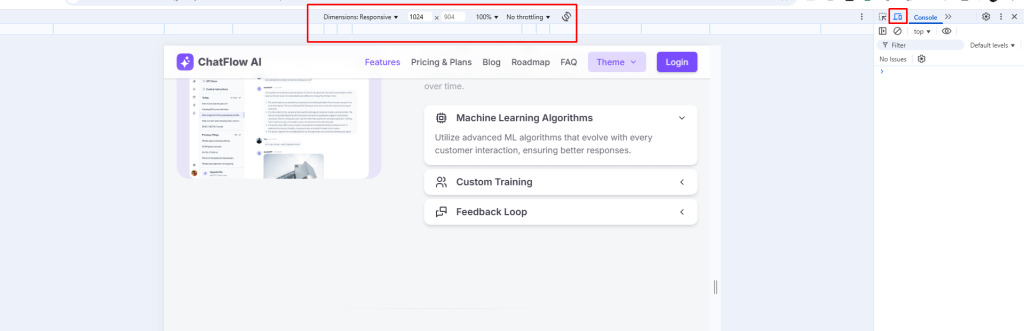
- Use Chrome DevTools’ Device Toolbar to simulate different mobile, tablet, and desktop devices.
- Ensure the developer has used CSS media queries correctly so that elements scale or reposition as the screen size changes.
- Test touch interactions on mobile devices to ensure buttons and form fields are large enough for easy navigation.
Responsive frontend testing ensures that your application provides a good user experience across all devices, whether on a desktop or a mobile phone.
5. Using the Inspect Tool (Ctrl + Shift + C)
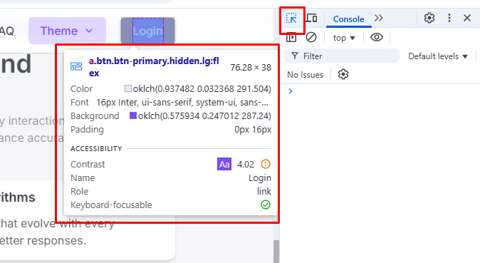
The Inspect Tool in Chrome DevTools is one of the most valuable tools for UI frontend testing. It lets you inspect individual elements, adjust styles in real-time, and test the responsiveness of your layout.
Key Features:
- Element Inspection: Quickly check the styles, padding, margins, and layout properties of any element.
- Live Editing: Modify CSS and HTML directly in the browser, allowing you to experiment with different styles without modifying the codebase.
- Box Model Visualization: View the box model for each element to check for spacing issues or misalignments.
- Media Query Testing: Simulate different screen sizes and test the responsiveness of your application.
List of Extensions that might help:
Here are some Chrome extensions that can assist with frontend testing:
- Grid Ruler: Helps create and overlay a grid on web pages to check element alignment and spacing accuracy.
- Dimensions: Measures the distance between two elements to verify consistent spacing.
- WhatFont: Identifies fonts used on a webpage with a simple hover and click.
- Designer Tools: Provides a ruler, color picker, and grid overlay for precise UI inspection.
- Clear Site Data: Clears cache, cookies, and storage to ensure fresh testing of web applications.
- HTML Validator: Validates HTML for errors and warnings directly in the browser’s console.
- SEO Broken Link Checker: Scans web pages for broken links, improving SEO and user experience.
Conclusion
So, this was the guide on frontend testing like a pro. We have tried to cover the all the important aspects in this guide.
Thoroughly testing your front-end ensures a seamless user experience and prevents potential bugs from reaching your users.
By following a structured approach to both functionality testing and UI testing, and using the right tools, you can create high-quality front-end applications that are both reliable and visually appealing.
Start incorporating these strategies into your workflow, and you’ll soon be testing your front end like a pro!