


Last night, while scrolling through a grocery app for a work project, I started feeling hungry.
Now, this might not sound important or shocking, but I already had dinner and a snack.
Was I really hungry, or did I just want to order food? I kept wondering.
Apparently, I wasn’t hungry; I just had this sudden urge to buy food and grocery items. It felt like I was missing a good deal.
Why?
Well, it’s not an accident. The apps are literally designed to make you hungry and start shopping. To understand why, you need to explore color psychology in web design and how visual choices can influence emotions, attention, and user behavior.
When designers are organizing web elements, they are not just putting pictures and text together. They are helping the user to connect emotionally. The use of color and text triggers a response in the brain.
What triggers it and how, if you want answers to all these questions, then keep reading.
When you design a website, you aren’t just organizing text and pictures. You are building an emotional journey. By understanding how the human brain reacts to colors and fluid visual changes, you can guide user behavior without them ever realizing it. This is also why elements such as a logo maker can be useful for creating a visual identity that matches the emotions and associations a brand wants to communicate.
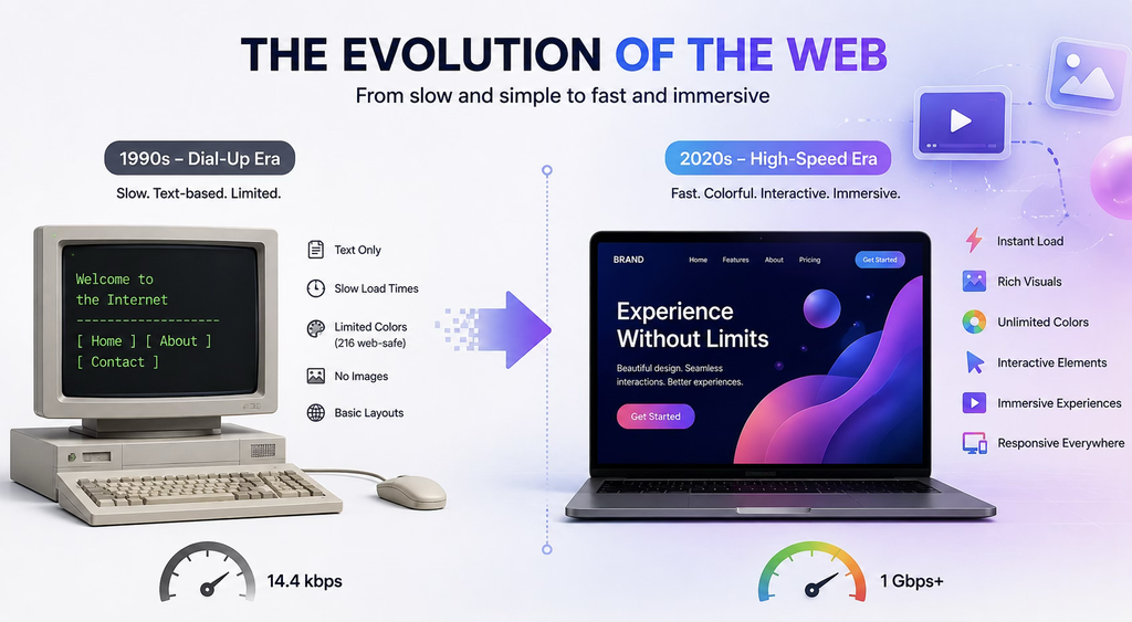
Transformation from Dial-Up Gray to High-Speed Glow
As a millennial, I have lived through the internet gray era. During that time, everything was slow and took time.
So, if you really want to know about color and graphics, then you need to look at the start of the internet. During the early days, the internet was as colorless as a newspaper.
Everything was static, flat, and just boring. You could literally see text blocks everywhere. Web designs had tech limitations. Since dial-up was painfully slow, even a basic text page would take time to load. So, web designers avoided using images.
Consequently, they relied on a tiny palette of 216 “web safe” colors.
However, things have changed since the internet evolved and became accessible to everyone.
Now, the internet is better, and even residential ISPs like Xfinity are offering the best speed in affordable prices. Additionally, round-the-clock assistance from Xfinity customer service makes it easier to troubleshoot issues instantly. With the support of fast internet today, you can download a massive amount of data in just a few seconds. The whole web page will literally load in no time.
Brands no longer have to stick to a simple layout. They can seamlessly try complicated graphic transformations, ultra-high-definition color gradients, 3D interactive elements, and immersive video backgrounds.
This also means that designers sitting behind the screen have become so powerful that they can convince people to commit actions with just the colors and design.
How Colors Impact the Minds of Website-Visitors-Turned-Consumers
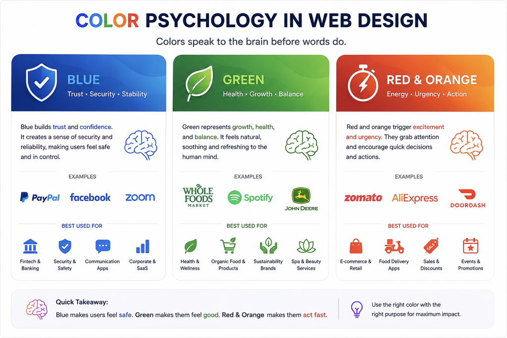
If you get into the psychology of colors, you will realize that long before most of us get to read the heading or understand the image, our minds pick up colors. This is the same principle that is used by artists and designers today.
To give you a perspective, here is a quick overview of the color impact so you can understand the brand psychology better.
Blue
Ideal for: fintech and online payment-related apps
This color mainly represents trust and security. This is the reason most fintech, security, safety, and communication-related companies use blue in their designs. This helps them build credibility, and the use feels stable, safe, and secure. This also naturally lowers the heart rate, making the individual feel safe.
Green
Ideal for: food, wellness, and health brands
Green color represents growth and health. This is another soothing color that is close to nature, so as a user, you feel fresh, balanced, and healthy. This is the reason you will notice organic food, wellness, and sustainability brands using green color. This color also signifies positive reviews, so brands using cruelty-free items also use this color.
Red And Orange
Ideal for: food delivery ecommerce and shopping-related brands
Bright red and orange colors mainly represent urgency. These colors trigger the brain to take action faster. So, if you are a business trying to sell faster, have a clearance sale, or want to create FOMO so the user can instantly start buying, then these colors are ideal for you.
The Use of Graphic Transformation as a Design Language
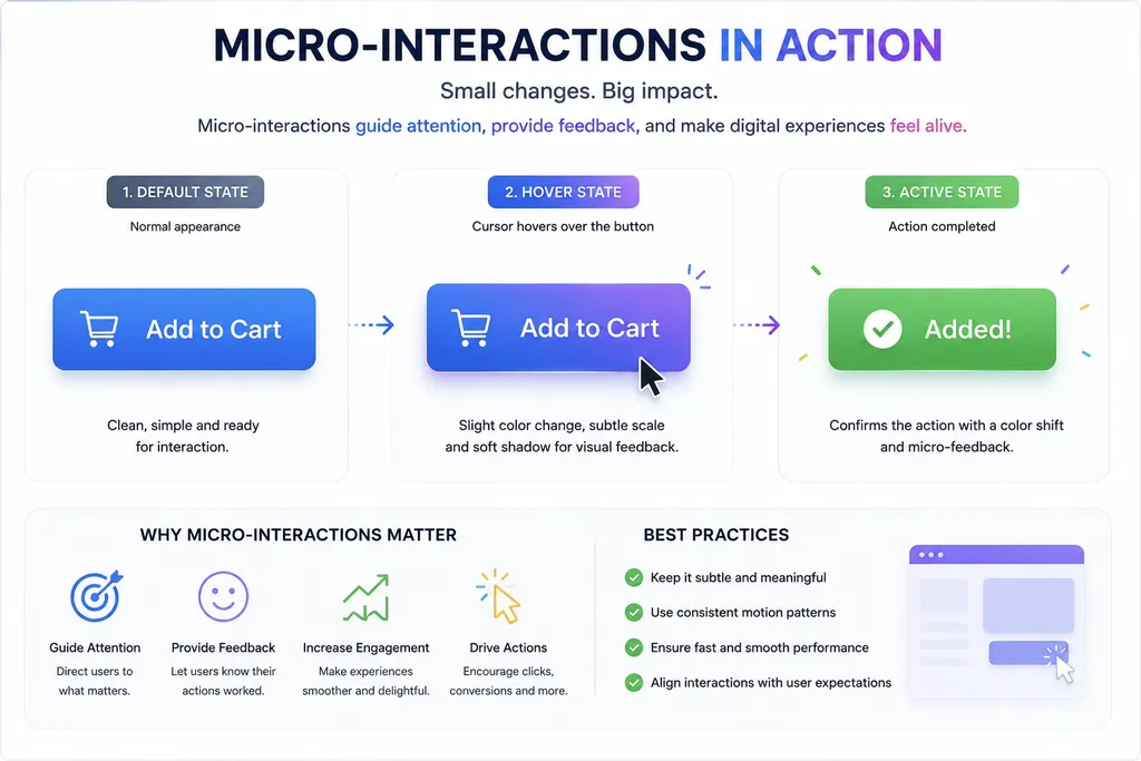
As mentioned earlier, colors set the mood. However, as a designer, you must also understand the importance of graphic transformation.
So, what is a graphic transformation?
A simple answer is that graphic transformation is a simple change that transforms the state of the element.
For instance, in ecommerce stores, you must have seen a flashy button that changes color when your cursor hovers over it. Additionally, you must have also noticed a simple image that instantly becomes bigger once you hover or point the cursor at it.
As a designer, when you combine color and motion together, it triggers a powerful cognitive element. This effect is usually called micro-interactions.
So, every time you get closer to a button or point your cursor at something that changes shape or color, you experience a micro-interaction.
The negative impact of the visual design
Now that we have talked about a good and effective design, you might be wondering if there is a bad design as well?
Honestly, most designers think that to make a website or app interesting, you must add a lot of visual transformation.
In reality, more visual transformation only ends up distracting the user. When you overload the design with graphic transformation, it causes cognitive friction. Consequently, your user will feel mentally exhausted, and your design will be too chaotic.
So, what’s the solution?
The golden rule of design is to use 60% dominant colors for the background. This gives it a neat and minimalistic effect. Maintaining these choices consistently across a product is also one of the core principles behind a good design system. Then you can top it off with 30% of structural elements like text and elements. Finally, you can finish it with 10% high-contrast accent colors.
Simply put, web design is an art that requires a complete understanding of human behavior. It is a silent conversation with the viewer, so make sure you use every element wisely.

