


You’ve got just a few seconds to make a good first impression with your website—and if something feels off, visitors won’t stick around. Whether it’s slow loading, confusing layouts, or small technical hiccups, certain things can turn people away instantly.
These website mistakes might seem small, but they add up fast. Let’s break down some of the most common website turn-offs and how to fix them.
Table of contents
Confusing or Over-complicated Navigation
When someone lands on your site, they should instantly understand how to move around. If the navigation is messy, overloaded with options, or labeled in confusing ways, it creates friction.
Users don’t have the patience to figure things out — they’ll leave and likely won’t come back.
Clear, intuitive navigation is one of the most important aspects of a good user experience.
🔍 Why It’s a Problem
- Visitors can’t find what they’re looking for quickly
- Inconsistent or cluttered menus increase frustration
- Buried pages are harder for both users and search engines to reach
✅ What You Can Do
- Limit top-level menu items: Stick to 5–7 main categories. Too many choices can overwhelm users and dilute the importance of your key pages.
- Use clear, universal labels: Avoid overly broad or vague terms that don’t clearly indicate what the user will find. Use familiar language like “Pricing,” “Features,” or “Contact” that communicates purpose at a glance.
- Avoid deep nesting: Drop-down menus are fine, but going more than two levels deep makes navigation confusing—especially on mobile devices.
- Include a prominent search bar: A visible search function helps users quickly find what they need, especially on content-heavy or e-commerce websites.
- Highlight key actions or pages: Draw attention to important links like “Start Free Trial” or “Request a Demo” using subtle design cues like color, button styles, or placement.
- Test navigation across devices: Menus might look great on desktop but collapse poorly on mobile. Always test your navigation on multiple screen sizes to ensure consistency and usability.
Asana is a good example of clean, user-friendly navigation.

Asana’s clean navigation example
Asana uses clear, action-oriented labels like “Product,” “Solutions,” “Resources,” and “Pricing.”
Each dropdown is well-organized with straightforward links such as “Project Management,” “Product Overview,” and “Enterprise.”
This helps users quickly understand where each link will take them, reducing confusion and making it easy to explore the site.
Technical Errors and Broken Elements
Even a well-designed website can lose credibility if basic functionality fails. Technical issues can instantly damage user trust and cause visitors to leave before taking any meaningful action.
Unlike design flaws, users are less forgiving of broken features — especially when they’re trying to complete a task. With Gcore, performance and reliability become critical to delivering a smooth user experience.
For many teams, especially those managing WordPress sites, these kinds of errors can be hard to prevent or fix consistently, particularly as projects scale or deadlines tighten. This is why some businesses choose to partner with a white-label WordPress development, allowing them to proactively address technical issues, improve workflows, and ensure reliable site functionality without burdening their internal resources.
🔍 Why It’s a Problem
- 404 pages or broken links make your site feel unprofessional and poorly maintained
- Forms and buttons that don’t work interrupt the user journey and block conversions
- Script errors or failed elements can break layout, hide content, or make entire sections unusable
What You Can Do
- Use automated site auditing tools: Online tools like Screaming Frog make it easy to keep your website in good shape. They scan for broken links, missing assets, and crawl errors so you can fix issues before they affect visitors.
- Track real-time errors: Set up monitoring with platforms like Sentry or Rollbar to log technical issues as they happen, making it easier to fix problems quickly.
- Monitor uptime and load speed: Use services like Pingdom or UptimeRobot to get alerts if your site goes down or slows significantly, so you can respond before it affects users.
- Test key user flows regularly: Check your forms, buttons, and checkout process manually to ensure critical site functions work correctly, especially after updates or design changes.
- Document your error-handling process: Create a system for tracking, prioritizing, and resolving technical issues efficiently, especially if multiple people work on your site.
- Consider screen recordings: Tools like Microsoft Clarity and Hotjar show how people actually use your site. Watching real sessions helps you spot UX issues, confusing layouts, or broken elements you might miss otherwise.
Poor Content and SEO Missteps
Have you ever landed on a website, started reading, and immediately felt like the content wasn’t speaking to you?
Maybe it felt stiff, overly formal, or just plain unhelpful.
When content isn’t engaging or doesn’t provide value, visitors won’t stick around — and neither will search engines.
🔍 Why It’s a Problem
- Flat, vague, or low-effort content (the kind a plagiarism checker often flags as recycled) makes your site feel untrustworthy or unhelpful
- Pages that don’t match search intent lead to high bounce rates and lower rankings
- Overusing keywords or writing just for SEO can feel unnatural and off-putting
✅ What You Can Do
- Write with your audience in mind: Make sure your content answers specific questions, is engaging, and speaks in a tone your audience connects with.
- Use a simple, natural tone: If you’re creating content with AI, avoid robotic language. AI can help speed things up, but the content it produces still needs a human touch. There are specialized tools for humanizing AI content, like these free AI Humanizer and Humanizeaitext.co, which can make the tone more natural and easier to read. You can also check out this AI humanizer for similar functionality. If you don’t want to use additional tools, you can also simply try ChatGPT for free to humanize the content for you — but before publishing, make sure to run it through a ChatGPT checker to ensure it’s not flagged as AI-generated.
- Use proper heading structure: Use H1, H2, and H3 tags to organize your content in a readable way that helps both users and search engines understand your page.
- Focus on natural keyword use: Keywords should fit naturally within the content. Aim to create content that genuinely answers user queries, rather than just trying to rank for a term.
- Regularly update your content: Outdated information can hurt user trust. Refresh old pages with new data, images, and better organization to keep them relevant.
Intrusive Pop-Ups and Auto-Play Media
Nothing disrupts a browsing experience faster than an unexpected pop-up or a video that starts playing on its own.
These elements can feel aggressive, especially when they appear too soon, cover the entire screen, or blast sound without warning. Instead of grabbing attention, they often push users away.
🔍 Why It’s a Problem
- Pop-ups that appear instantly or block content frustrate users
- Auto-play videos with sound are disruptive, especially on mobile or in quiet environments
- Poorly timed or frequent pop-ups can make your site feel spammy or annoying. They can also hurt your SEO, as Google discourages intrusive interstitials and dialogs.
✅ What You Can Do
- Use pop-ups thoughtfully: Delay pop-ups until the user has shown some engagement. Most popup tools let you control timing and triggers based on user behavior.
- Mute auto-play by default: If you use video, make sure it plays silently unless the user interacts. Vimeo allows you to customize autoplay settings easily.
- Test on mobile devices: Pop-ups and media behave differently on mobile. Make sure they don’t block navigation or create a frustrating experience on smaller screens.
- Limit the number of pop-ups: Stick to one clear message and avoid overwhelming users. ConvertBox helps manage and rotate pop-ups without stacking them.
- Make sure pop-ups don’t block main content: Design your pop-ups so they don’t cover essential information or navigation. Users should be able to keep browsing easily without being forced to close a pop-up.
Even small changes to how and when pop-ups or media appear can make a big difference. When they feel smooth and well-timed, users are more likely to stay, not leave.
Cluttered Design & Bad Typography
Sometimes, it’s easy to focus on content or performance and assume your design is still fine — especially if it’s worked for years. But design standards evolve quickly, just like everything else online. Keeping up with modern design trends helps your site stay relevant and visually trustworthy. Using design templates is a simple way to keep your visuals fresh and consistent
🔍 Why It’s a Problem
- Overwhelming visuals cause cognitive overload and make users leave faster
- Inconsistent fonts, poor alignment, or low contrast reduce readability and hurt your brand
- Bad typography can make even great content feel unprofessional
✅ What You Can Do
- Use whitespace intentionally: Give your content room to breathe. Spacing helps guide the eye and makes information easier to process.
- Stick to 2–3 font types: Too many fonts can feel chaotic. Choose one or two for headings and one for body text — and make sure there’s enough contrast.
- Make sure your logo is sharp and up to date: A blurry or outdated logo can make your site look unprofessional. Use a high-resolution version and make sure it scales well on all devices.
- Use ready-made UI templates for web projects: If you’re working on dashboards or admin panels, starting with a modern UI kit saves time and improves quality. You’ll find a range of high-quality options at ThemeSelection — our own site offering free and premium templates that are clean, responsive, and easy to work with.
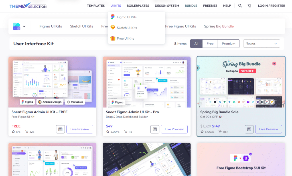
UI Kits on ThemeSelection
The same design principles apply not just to your website, but also to other touchpoints. Your website is not the only place that represents your brand.
Any materials you share should follow the same basic design principles to keep your branding consistent — presentations, for example, are often overlooked but should also match your brand style. If you’re creating one, make sure it looks professional (there are plenty of free PowerPoint templates online that can help with that) and sends the same signals as your website and other brand assets.
This kind of consistency across different channels — even in print (yes, print is not dead!) — strengthens your brand and makes it more memorable.
Annoying or Non-Existent Cookie Banners
Cookie banners are a legal requirement in some regions, but when done poorly, they can annoy users or even drive them away. A confusing or overly aggressive banner makes your site feel unprofessional, while not having one at all could put you at legal risk.
🔍 Why It’s a Problem
- Missing consent banners can lead to privacy law violations (like GDPR)
- Overly large or unclear banners disrupt the experience
- Users may leave if the message feels pushy or confusing
✅ What You Can Do
- Use a proper cookie consent tool: There are plenty of tools out there that can help you meet privacy regulations while keeping the design clean and easy to manage. Find the one that works for you.
- Keep the banner simple and non-intrusive: Avoid full-page takeovers. A small, well-placed banner with clear options is usually enough.
Slow Loading Speed
Finally, don’t forget about your website speed. If your site takes too long to load, many visitors will leave before they even see what you offer
🔍 Why It’s a Problem
- Users expect pages to load in under 2–3 seconds
- Slow load times increase bounce rates
- Poor performance negatively affects search rankings
✅ What You Can Do
- Compress your images: Use tools like TinyPNG or convert files to WebP to reduce image size without losing quality.
- Lazy load media: Only load images and videos when users scroll to them, so your pages load faster up front.
- Use a CDN: Content delivery networks like Cloudflare improve load speed by serving content from servers closer to the user.
- Minify your code: Simplify your CSS and JavaScript by removing unnecessary characters, spaces, and comments to reduce file size.
- Regularly test your page speed: Run regular page speed tests, especially with PageSpeed Insights by Google to make sure your website stays fast and performs well.
Final Words
We’ve discussed some of the most common things that can instantly turn users away from a website — and more importantly, how to fix them. The key is to pay attention to the details, stay user-focused, and keep your site evolving as expectations change.
If you want to dive deeper into web development, design, and user experience, feel free to explore more on our blog.

