


User Experience (UX) Design is one of those terms everyone uses but very few truly understand. Some people think UX is about buttons and colors. Others think it’s just about research.
In reality, UX is much bigger than that.
This article will help you clearly understand what UX is, why it matters, and what the core components of UX design are without confusion or theory overload.
Table of Contents
What Is UX?
What is the Meaning of UX, User Experience? It is how a person feels while using a product, and how easy, clear, and comfortable it is to achieve their goal and interact with this product
UX includes:
- How easy it is for users to understand the product
- How smoothly they can complete their tasks
- How clear, comfortable, and confident they feel while using it
- How the product responds to their actions and expectations
A Real-World Example
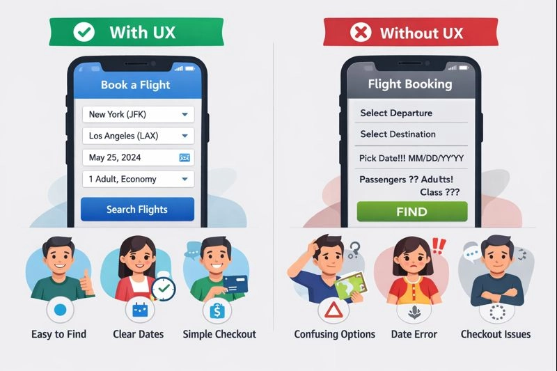
Imagine you want to order food through a mobile app.
If you can:
- Easily find restaurants
- Quickly understand prices and delivery times
- Complete checkout without confusion
The experience feels smooth and satisfying.
Now imagine:
- You can’t find the menu
- Buttons don’t respond properly
- Error messages don’t explain what went wrong
Even if the app looks visually impressive, the experience feels broken. That is the easiest way to understand User Experience(UX).
What is a UX Component?
Now we are moving on to our main topic about the UX Component. Many designers and Developers are confused about the UX Component Word. They are all thinking about Card Component, Button Component, and Dialog Component
Yes, your confusion is right because we are not familiar with this UX component word. We know we only know about Component Word, so let’s clear this confusion
Why does this confusion happen?
In the Design and Product world, “Component” is used in two different ways: first, it is used for UI Component, and second, it is used for UX Component.
Example:
- UI Component :
- Buttons
- Card
- Input
- Modal
- Dropdown
These are the UI Design Components
- UX component :
- User Research
- Information Architecture
- Interaction Design
- Usability
- Accessibility
These belong to the UX Design Component. Also, this UX Component is known as the foundational component of UX Design.
Now We Learn About UX components in real-life examples, how they actually work. UX components are not visible, but they’re very important
We are taking a driving car as an example: In this car, we all know what UI components like the steering wheel, Pedals, Dashboard buttons, screens, etc. are…
But what about the UX Component?
- Is the car easy to drive?
- Are controls intuitive?
- Alignment of mirrors
- Hand Break Option
- Airbag Option
- Seat Comfort
The experience of driving easily is the UX and Component. In UX design, the word “component” does not only mean UI elements like buttons or cards. It refers to the key experience-building components, such as research, usability, and interaction, that define how a product feels to use.
Check out the best Figma UI Kit – Sneat

What are Core UX Components
UX Components are mainly building blocks shaped to how users will interact with the product, and how they feel the main goal is that users will complete all tasks very easily, and it feels so smooth. They focus on understanding users, guiding them, helping them act easily, and making sure no one feels frustrated.
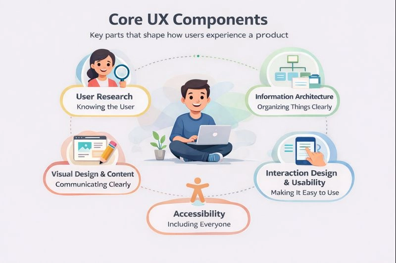
Mainly, we have 7 types of UX Components
- User Research
- Information Architecture
- Interaction Design
- Usability
- Accessibility
- Visual Design
- Content & Microcopy
User Research
User Research is the foundation of UX design. It focuses on understanding who the users are, what problems they face, and what they actually need from a product. Instead of relying on assumptions or personal opinions, designers learn directly from real users through conversations, observations, feedback, and usage data.
Good user research helps answer important questions like: What are users trying to achieve? Where do they struggle? What frustrates them the most? When a product is built based on real user insights, it fits better into real-life situations. Without user research, even well-designed products can fail because they solve the wrong problems.
Information Architecture
Information Architecture is about how information is organized and structured within a product. It decides where content, pages, and features live and how users move between them. The goal is to make everything feel logical and easy to find.
When information is well organized, users don’t need to think too much. They can quickly understand where they are and where to go next. Poor information architecture makes users feel lost, even if the interface looks good. That’s why clear structure and navigation are critical parts of a good user experience.
Interaction Design
Interaction Design focuses on how users interact with the product. It defines what happens when users click a button, scroll a page, submit a form, or make a mistake. This includes feedback like loading states, success messages, and error handling.
Good interaction design makes the product feel responsive and predictable. Users should always know what is happening and what will happen next. When interactions are unclear or inconsistent, users feel confused and unsure. Smooth interactions build trust and make the experience feel natural.
Usability
Usability is about how easy the product is to use. A usable product allows users to complete tasks quickly and naturally, without instructions or extra effort. Users should understand what to do next without stopping to think.
When usability is poor, users feel frustrated, make mistakes, or give up—no matter how attractive the design looks. Good usability reduces confusion, saves time, and makes users feel confident while using the product.
Accessibility
Accessibility ensures that a product can be used by everyone, including people with different abilities, devices, or environments. This includes users who rely on keyboards, screen readers, or need better contrast and readable text.
Accessibility is not just for a small group of users. It improves the experience for everyone, including users in low-light conditions, slow networks, or small screens. A product is not truly user-friendly if it only works well for some users.
Visual Design
Visual Design supports UX by making the interface clear, readable, and easy to understand. It helps guide users’ attention, highlight important actions, and create a clear visual hierarchy.
Even with strong UX thinking, if visual elements are unclear or poorly designed, users may struggle to complete their tasks. Visual design should support usability and interaction, not distract from them. Good visuals help users move confidently through the product. Before moving a design into development, it’s often helpful to visually validate layout ideas early on. One practical approach is using a tool for visual mockup design to quickly turn concepts into structured screen previews. This helps teams refine spacing, hierarchy, and overall usability before investing time in full UI development.
Content and Microcopy
Content and microcopy are the words used inside the product—such as button labels, instructions, error messages, and helper text. Clear and simple wording helps users understand what to do and what is happening at each step.
Good microcopy reduces confusion, prevents mistakes, and makes the product feel more human and supportive. When content is well written, users don’t need extra guidance or explanations—they naturally understand how to use the product.
How These Components Work Together
All these core UX components work together as a system. User research informs structure, structure supports usability, usability improves interactions, accessibility applies everywhere, and visual design and content tie everything together.
When these components are aligned, the product feels simple, clear, and enjoyable to use. When even one component is weak, the overall user experience suffers.
You can consider using libraries such as Shadcn Studio, which offers ready-to-use Shadcn Components and Shadcn Blocks.
Conclusion
UX design is about making products easy and comfortable for people to use. It goes beyond visuals and focuses on understanding users, organizing information clearly, and designing interactions that feel natural.
When core UX components work together, the experience feels simple. Users may not notice good UX, but they always notice when it’s missing.

