A nice navigation bar acts as the main guide for visitors, therefore helping them explore your website easily while setting the overall look and feel. Thanks to Framer’s easy-to-use tools and active community store, you can now add attractive, fully working navbars with very little effort. So, below you’ll find great Framer navbar resources & examples, from store picks to free community options, that can quickly improve your site’s ease of use and overall look.
Table of contents
What Is Framer?
Framer is a strong no-code tool made for building fast, mobile-ready websites with high-quality results. As a result, it lets designers create layouts by sight while making clean code behind the scenes.
In addition, Framer is great at making landing pages, startup sites, and engaging experiences that need smooth motion and a fast launch. It’s easy editor, automatic mobile support, and quick publishing help busy teams and solo creators work faster.
What’s more, you can start with AI-helped layouts or blank pages, adjust every detail, and publish straight to a fast worldwide network. On top of that, Framer offers built-in content management, performance checks, A/B testing, and search improvement tools – perfect for designers working with developers or growth teams.
Leading brands such as Miro, Perplexity, and Scale rely on Framer for their main online presence.
Main Advantages
- Rapid design-to-launch workflow
- Automatic mobile-friendly layouts
- Visual editing with deep customization
- Native CMS for managing dynamic pages
- Built-in speed and SEO enhancements
- Real-time team editing support
- Suitable for small projects through large-scale sites
Now, let’s head to the best Framer Navbar Resources & Examples.
Best Framer NavBar Resources & Examples
Framer navbar resources enable the quick creation of flexible, moving menus that work smoothly on every screen size. They come ready with hover effects, scroll behaviors, and easy styling options, so your site feels modern and easy to use. As a result, these resources are great for creating clean experiences without starting from zero.
Here are some of the best inspirational Framer navbar examples & resources available right now.
AeroNav 3D

AeroNav 3D gives a rich, semi-clear look inspired by modern device designs. So the cursor moves across it, the bar gently tilts in three directions, adding depth and interaction in a smooth, polished way.
The element adjusts automatically to different devices, delivering an upscale appearance everywhere. It fits beautifully in various scenarios, including:
Use Cases:
- Personal showcase sites – lend a sophisticated touch to your projects
- Software-as-a-Service pages – deliver clean, trustworthy navigation
- Design studio homepages – highlight your expertise right away
- Promotional one-pagers – capture attention from the first second
- Contemporary online presences – suit sleek, forward-thinking aesthetics
Customizations:
- Menu entries – insert, delete, or rearrange links with your own wording
- Theme modes – switch freely between bright and dark schemes
- Placement options – position at the top, base, or sides instantly
- Text styling – choose fonts that align with your identity
- Tilt sensitivity – control how pronounced the 3D movement becomes
- Control visibility – toggle helper settings on the canvas
Thus, AeroNav 3D works well for projects that want a clean, modern look with gentle interaction.
ClearNav
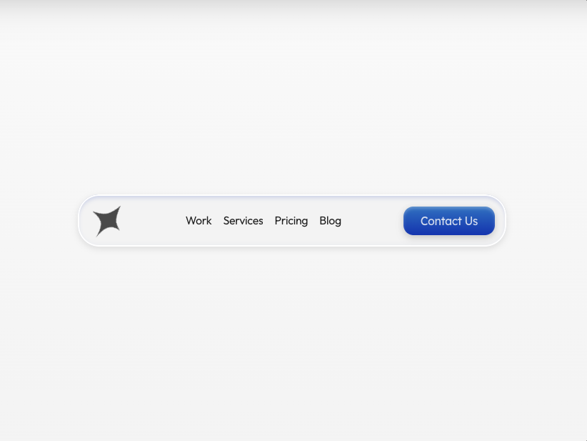
ClearNav focuses on openness and subtle design with a soft, see-through style that blends smoothly with what sits behind it. Also, the bar uses gentle scroll-based motion and soft effects to add depth without taking attention away.
Furthermore, its restrained design keeps performance light while projecting elegance. Thus, it works especially well when the menu needs to support rather than overshadow rich content. Perfect for situations like:
Use Cases:
- Content-driven blogs – remain noticeable yet non-intrusive
- Online stores – keep shoppers’ attention on the merchandise
- Artist portfolios – frame creative work elegantly
- Knowledge bases – offer structured access without distraction
- Company homepages – convey reliability and refinement
Customizations:
- Transparency tuning – balance see-through strength precisely
- Blur amount – dial in the softness level
- Tint adjustments – match hues to your visual identity
- Margin control – decide between tight or generous spacing
- Motion timing – refine how quickly effects respond
- Edge treatments – add faint borders or keep fully seamless
Therefore, ClearNav is a great fit for content-first sites that want subtle navigation without pulling attention away.
Aave NavBar
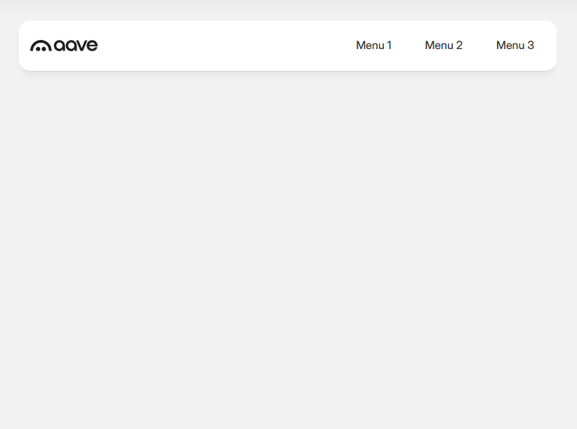
Aave NavBar takes inspiration from the Aave finance ecosystem and blends clean polish with easy handling. So, it uses strong text, roomy spacing, and soft color changes to create a clear and confident feel.
Moreover, tiny response animations also provide reassuring feedback, which proves valuable for sites dealing with important decisions or data. Well-suited to contexts such as:
Use Cases:
- Financial tools – build an immediate sense of security
- Blockchain projects – adopt a contemporary tech vibe
- Control panels – simplify access to layered information
- Consulting services – signal expertise and dependability
- Large-scale software – create executive-friendly interfaces
Customizations:
- Color flow – set gradient direction and shades accurately
- Element appearance – choose solid, outline, or minimal looks
- Symbol support – integrate icons from common sets
- Type scaling – vary weights for clear visual order
- Interaction presets – pick from several hover styles
- Screen-size rules – adapt smoothly to phones through desktops
Furthermore, this navbar also supports clear decisions, steady interaction, and a confident overall experience.
Checkout the best free Bootstrap template:

This free Material Design Dashboard is one of the best resource for developing engaging web apps.
Spotlight Navbar resource
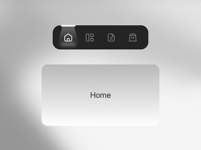
Spotlight Navbar resource adds drama by showing a moving light on the selected menu item as the user interacts. So, soft fades and smart overlays keep the focus clear and make browsing feel more engaging.
The effect can react to both mouse and keyboard focus, keeping inclusivity high along with the flair. So, great for projects including:
Use Cases:
- Media and streaming platforms – heighten visual drama
- Gaming destinations – match energetic environments
- Event promotion pages – generate buzz effectively
- Design collectives – display creative interaction skills
- Campaign microsites – drive higher user involvement
Customizations:
- Beam dimensions – shift from narrow to wide coverage
- Gradient layers – build richer color progressions
- Movement curve – fine-tune how fluidly the light travels
- Brightness balance – adjust active vs. dimmed contrast
- Edge softness – decide sharp cut-off or gentle fade
- Extra shine – layer additional glow for emphasis
So, because of this, and in the end, Spotlight Navbar Resource is a strong pick for projects that want attention, clarity, and inclusive interaction without losing control.
Floating Dock
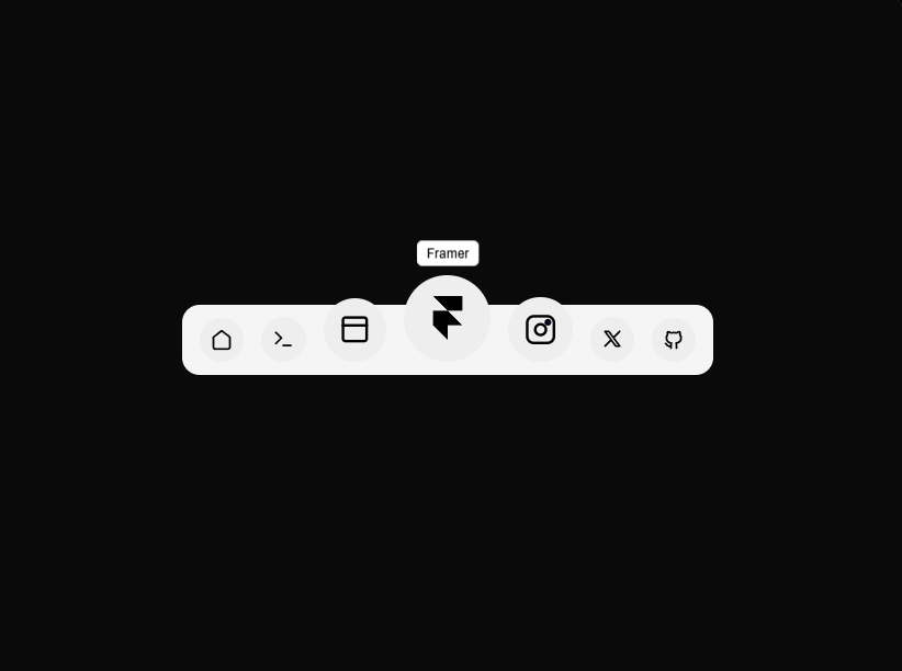
Floating Dock recreates the classic macOS bottom dock using modern Framer features. So the cursor moves closer, icons grow smoothly, tooltips appear with soft motion, and the whole dock floats in a clean, elegant way.
On mobile, it changes into a compact animated menu for easy access. So, it creates navigation that feels touch-friendly, easy to find, and smooth to use. It works well for:
Use Cases:
- Hero landing pages that need engaging bottom navigation
- Creative or portfolio sites that need a polished feel
- Apps like websites that follow familiar system patterns
- Design systems that need a ready dock layout
- Modern demos that show interaction and motion clearly
Customizations:
- Icon scaling – adjust magnification strength and range
- Tooltip behavior – control appearance, timing & style
- Mobile switching – fine-tune compact menu animation
- Positioning – tweak dock placement and padding
- Theme adaptation – match light/dark modes seamlessly
- Interaction tuning – modify spring physics and easing
So, in the end, because of this, Floating Dock works well for teams that want smooth motion, clear access, and a familiar system feel.
Motion X Navbar
Motion X Navbar, available openly on GitHub, taps into Framer Motion for lifelike, bouncy movements in your menu system. Spring-driven transitions feel organic, while layout shifts handle content changes gracefully.
Its modular setup appeals to those who enjoy extending features while keeping things efficient.
Use Cases:
- Developer showcases – prove animation expertise
- Innovation-focused companies – signal cutting-edge approach
- Community-driven code repos – align with shared standards
- Teaching platforms – make interfaces more captivating
- Boundary-pushing experiments – explore new possibilities
Customizations:
- Physics tuning – modify bounce strength and settling
- Orientation flexibility – handle rows or columns equally
- Touch gestures – set swipe sensitivity thresholds
- State switching – define smooth multi-variant flows
- Departure sequences – craft unique exit behaviors
- Rendering efficiency – prioritize hardware-accelerated methods
So, in the end, it works well for projects that want playful motion and full control over behavior. Thus, consider this one of the best framer navbar resources for your project.
Framer Motion Navbar Example
This Framer Motion navbar example provides a practical, code-first approach to building animated navbars with Framer Motion. Also, the component showcases essential techniques like animated underlines, staggered menu reveals, and smooth page transitions.
At the same time, as an educational resource, it also helps developers understand the underlying principles while providing a solid foundation for custom implementations.
Use Cases:
- Learning Projects – Hands-on examples for studying Framer Motion
- Rapid Prototypes – Ready-to-use code for quick modifications
- Client Presentations – Demonstrate animation concepts interactively
- Technical Documentation – Illustrate motion design best practices
- Hackathon Projects – Starting point for complex navigation systems
Customizations:
- Code Structure – Fully accessible for complete customization
- Timing Functions – Adjust delay and duration values
- Component Architecture – Easy addition of items and dropdowns
- Styling – CSS-based for matching design systems
- Animation Variants – Duplicate and modify for custom effects
- Educational Comments – Includes explanations of key concepts
So, also, at the same time, and because of this, the Framer Motion navbar example is a strong learning and building resource, and in the end, it supports both quick experiments and deeper custom work.
Rotating Text Framer Navbar Resource
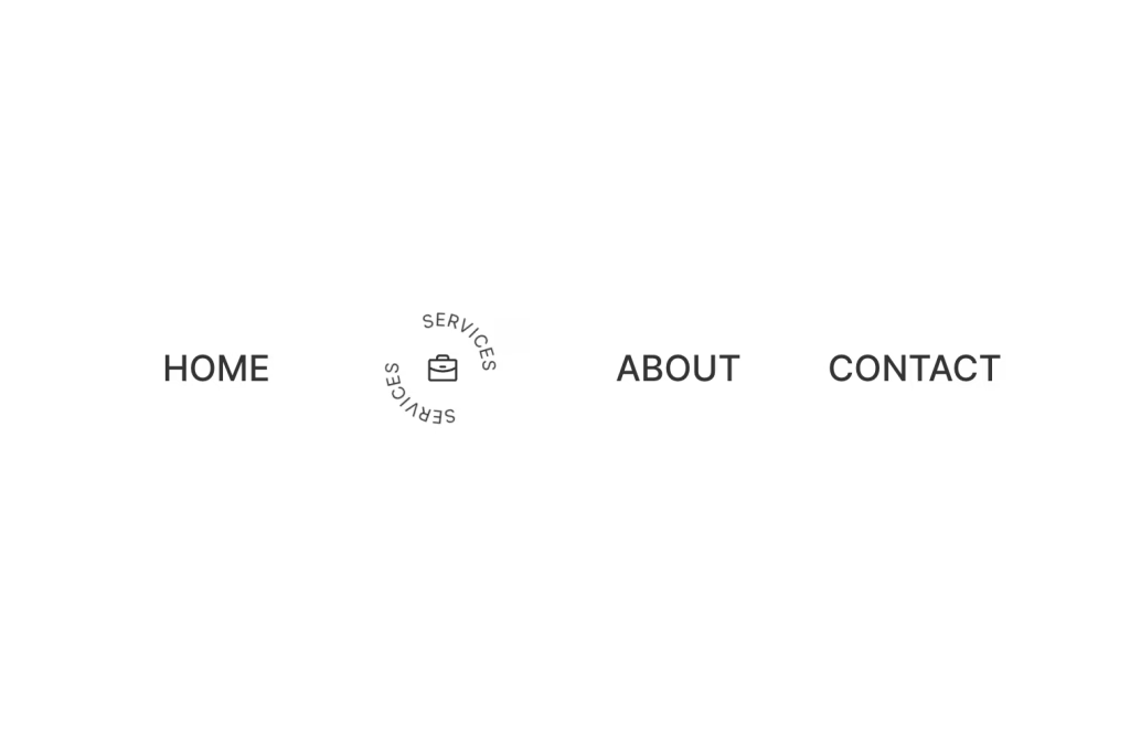
Rotating Text Framer Navbar Resource adds lively text movement by cycling through words or highlights inside the menu. So, the navigation feels active and eye-catching without being distracting.
This technique spotlights various messages or benefits dynamically while keeping the layout tidy. Synchronization with surrounding animations creates cohesive narratives. Fits well in scenarios such as:
Use Cases:
- Sales-focused sites – rotate key advantages
- New release pages – tease features sequentially
- Time-limited promotions – cycle urgent messages
- Global audiences – rotate language variants
- Content hubs – showcase trending topics
Customizations:
- Cycle pace – set rotation duration
- Message list – input as many entries as needed
- Transition types – select flip, dissolve, push, or grow
- Interaction pause – hold on mouse over
- Axis choice – vertical or horizontal movement
- Hue shifts – blend colors during changes
So, in the end, because of this, it works well for sites that want active navigation, clear messaging, and smooth flow without clutter.
Side Framer NavBar Resource
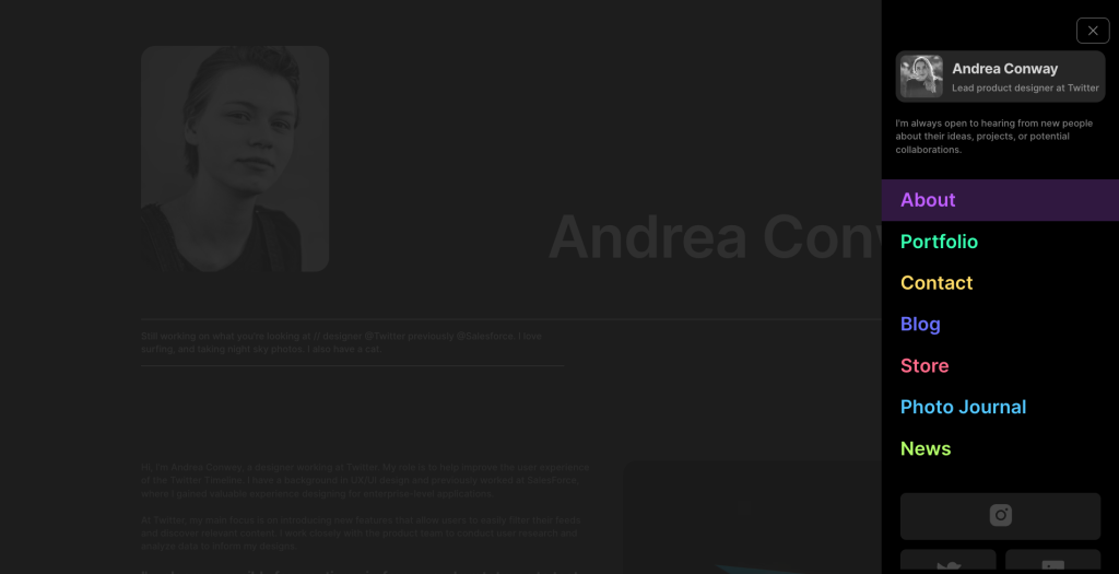
Side Framer NavBar Resource rethinks menu placement with a sliding panel design that saves horizontal space. So, it helps organize many options in a clear and simple way.
It offers fluid entry animations, expandable groups, and memory of user settings for better flow. Works effectively as either always-visible or toggle-activated. Suited to:
Use Cases:
- Management interfaces – handle deep option trees
- Backend systems – provide fast tool access
- Reference libraries – browse large knowledge sets
- Learning management systems – organize lesson structures
- Internal business software – support heavy feature sets
Customizations:
- Panel sizing – choose narrow or wide views
- Content push vs. overlay – select interaction mode
- Expandable groups – use accordion patterns
- Side alignment – left or right positioning
- Background dimming – apply blur or shade
- Close logic – auto-dismiss or stay open
So, because of this, and in the end, the Side Framer NavBar Resource is a strong choice for complex layouts, also helping teams keep many options clear, organized, and easy to access.
Morphing Navbar Animation
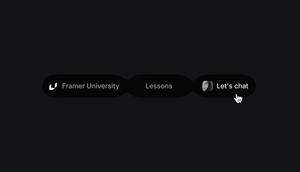
The Morphing Navbar Animation from Framer University shows how to build menus that change shape smoothly between states. So, the menu reacts naturally when users scroll or click
At the same time, background paths and items move together, creating a smooth flow that feels premium. Because of this, the method works well for sites that value steady, smooth movement.
Use Cases:
- Learning resources – teach sophisticated techniques
- Luxury brand presence – emphasize meticulous craft
- Narrative-driven experiences – maintain visual flow
- Presentation-style pages – captivate during walkthroughs
- Component showcases – highlight system capabilities
Because of this, you can adapt the setup to your needs. Consider these customization ideas:
Customizations:
- Activation methods – tie to scroll progress or user events
- Form outlines – redefine shapes for distinct looks
- Speed profiles – choose natural or bold easing
- Palette shifts – evolve colors in sync
- Position adaptations – handle varying content setups
- Device-specific rules – differentiate mobile and large screens
So, in the end, because of this, and at the same time, the Morphing Navbar Animation brings smooth motion and clear flow together, therefore making it a strong choice for sites that value calm, polished navigation.
Conclusion:
Picking the right navbar depends on your audience, your site goals, how much content you have, and how much you plan to customize. So, it’s important to think about who you’re designing for and what you want them to do. Also, premium marketplace options often offer cleaner details and steady updates, while free or open options give you more freedom to change things deeply. Because of this, both paths can work well depending on your needs.
At the same time, the best navbar is not just about looks. Instead, it should work smoothly and guide users naturally. So, when a navbar adds character without causing confusion, it helps strengthen your overall message. From simple transparent styles to bold interactive highlights or smart context-based systems, these ten resources show what modern navigation can do today.
In the end, each option has its own strengths and can turn a basic page into something more engaging and memorable. So, choose the one that fits your vision best and supports the experience you want to create.