


Have you ever struggled to understand your call tracking metrics, unable to distinguish between crucial and less important KPIs? It’s likely because your software wasn’t designed according to the best marketing practices, or you’ve got the wrong access level, or the learning curve was too steep.
The right suite of call tracking software should be both detailed and user-friendly. It’s one thing to have granular lead details collected and another thing to be able to interpret them, recognizing profitable marketing patterns that can actually grow your bottom line.
And it all starts with a dashboard.
Depending on the size of the company, around a dozen employees with different roles may have access to your call tracking software, and the first thing they see is the dashboard, which displays a collection of metrics. It’s quite natural that they should only see meaningful data that reflects your current performance and pace, and gives insights into whether something needs to be changed or adjusted.
Without any further ado, let’s dig into the most essential marketing performance metrics that performance marketers, affiliates, advertisers, and affiliate networks need in their call tracking dashboard and at deeper levels of their call tracking software.
Call Tracking Dashboard: Essential Performance Metrics
No matter the complexity of the software – for example, with Phonexa, you can go truly granular, dissecting every inbound caller individually, from source to quality to over a dozen other metrics – the call tracking dashboard is designed to keep you updated without overwhelming you.
- Having the right data in the right place in your call tracking dashboard is especially valuable for dynamic call tracking, where each inbound phone call is assigned a unique call tracking number and can therefore be tracked most thoroughly. This level of visibility becomes even more valuable for businesses using a VoIP phone system, where call data, recordings, and customer interactions can be analysed in real time to improve marketing and customer service performance.
Whether you’re designing the dashboard or using it as a performance marketer, the best strategy is to keep the most essential (usually financial) metrics at the forefront while leaving lower-level metrics to specific tabs. This way, you (and everyone who is using the dashboard) get an overarching view of call generation or call acquisition campaigns with just one click without having to understand deeper-level metrics and how to interpret them (like, for example, lead quality).
Here are some of the data you might want to have on your call tracking dashboard:
- Total Revenue
- Net Earnings
- Phone Calls Sold
- Earning per Call
- Total Calls Processed
- Acceptance Rate
- Conversion Rate
Depending on who and how you are going to use the dashboard, you can refrain from pulling metrics that can be derived from other metrics. For example, if you only need the highest-level KPIs in your call tracking dashboard, you might want to remove Earnings per call and Phone Calls Sold in favor of Net Earnings. But you still need these metrics in the background.
Here’s an example of what a call tracking dashboard might look like:

As a call tracking software user, you might want to see the most general metrics first, like your current total daily revenue versus the total daily revenue of the previous day and possibly also the previous weekly average. Then, for example, if the daily revenue is lower than expected, you can proceed to more granular metrics like lead-level and channel-level metrics.
How To Make a Call Tracking Dashboard More Intuitive
Software providers know that it’s not so much about incorporating useful and diverse features into call tracking software, but rather making it user-friendly so that clients of different levels can access the data they need without having to overcome a steep learning curve.
In practice, an intuitive dashboard can be made by enabling different access levels (admin, user, etc.) and visualizing the data with charts, tables, filters, and alerts. For most lead generators and buyers, it’s crucial to be the fastest player on the market, so you also need a quick notification system.
Charts
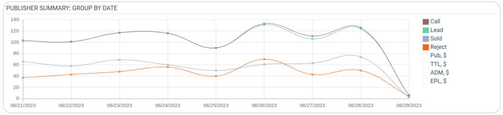
Charts are likely the most intuitive way to reflect the general direction of the campaign and its major metrics, like the number of generated, sold, and rejected calls, as well as earnings per call and some other financial statistics. However, different software users may have different visualization preferences, so it might be reasonable to get software that allows you to choose between several types of charts, like line, bar, and pie charts.
- Line charts – ideal for showing call volume trends over time
- Bar charts – ideal for comparing call tracking metrics across categories
- Pie charts – ideal for displaying proportions, such as the percentage of calls by source
Here’s what a visualization of call volume and sales may look like:
Heatmaps
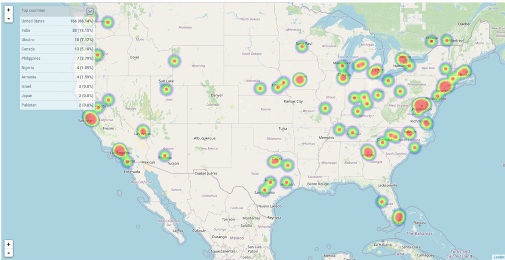
For call distribution across locations and time zones, heatmaps might be the best visualization tool, allowing you to evaluate your call campaign performance at a glance. For example, the heatmap below clearly indicates that most calls originate from the eastern part of the United States. With this in mind, you can prioritize targeting those regions or optimize your call distribution architecture.
Tables
Tables are the default yet no less effective way of presenting call tracking data as long as they are intuitive, interactive, and include filters so users can visualize the data sets they want to compare.
Whether developing or operating data tables as a software user, it makes sense to prioritize the most relevant columns – for example, call ID, timestamp, duration, source, and outcome – while being able to pull advanced analytics when needed.
Among other things, it makes sense to color-code important data and enable sticky headers so column names remain visible while scrolling. For larger scrolls, you might want to use pagination to prevent overwhelming users with thousands of rows at once.
Here’s what a general-level call tracking table may look like:
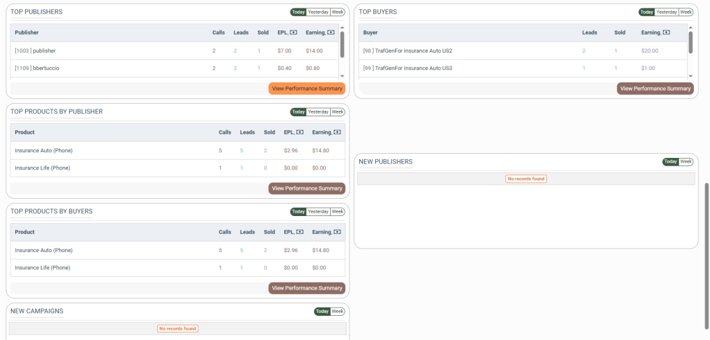
Going deeper into call details, you might want to use color-coding more extensively. For example, you may highlight duplicate, low-quality, irrelevant, or fraudulent inbound phone calls in red so users can immediately spot them and take action. For borderline calls, you can use yellow color, indicating that the call in question might need a manual check.

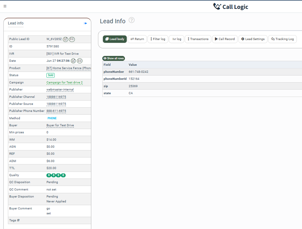
Finally, a table might be the best visualization tool to display lead-level details:
Filters
Filters narrow it down to specific data sets, so make sure to include a variety of filters that reflect the most common call tracking needs, such as filtering by campaign source, location, time, quality, product interest, publisher, advertiser, price, ID, etc.
Likewise, since there are dozens of useful filters, it’s important to distribute them strategically – high-level filters on the main dashboard and deeper-level filters on a dedicated section – and also prompt users regarding the filter they can apply and the results they may get from it.
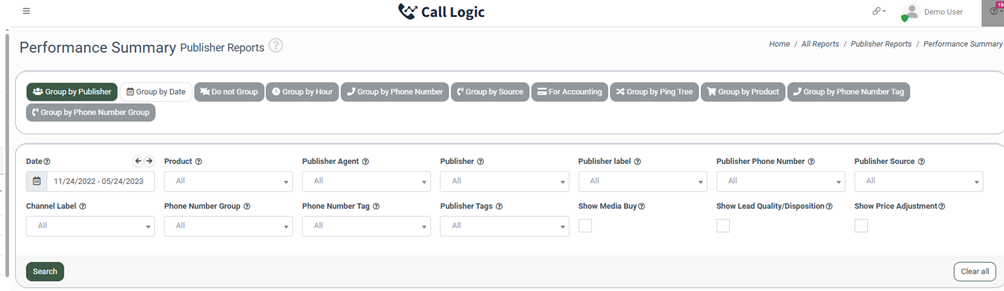
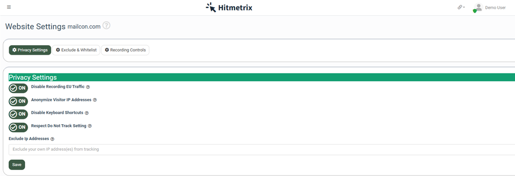
No less importantly, you can use filters at the campaign level to ensure compliance and grant the right access level to different categories of software users. On a similar note, if you’re using comprehensive lead management software, you might use omnichannel filtering to, say, block inbound phone calls that haven’t passed preliminary screening across the provided email or location.
Alerts
As it was already mentioned, whether you’re buying or selling leads, or you’re an affiliate network that mediates the process, it’s absolutely vital to be quick – and especially so when you’re competing against other lead buyers or sellers.
If you’re buying leads within a ping post lead distribution system, you may or may not have enough time to verify them before buying, so you have to customize your strategies accordingly, only verifying calls coming from new and untested sources.
The good news is that you can become quicker simply by using filters, toggling them on and off to ensure the optimal alerts and response time.
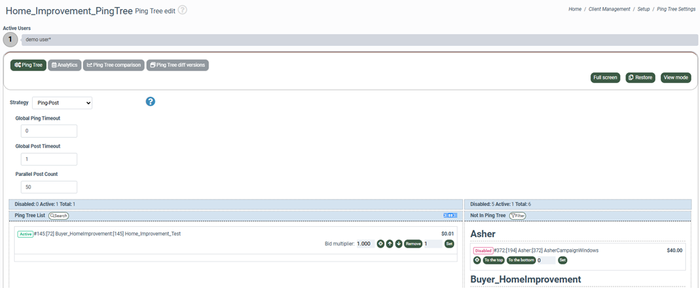
Here’s an example of an interface where you can build a ping tree for your lead flows:
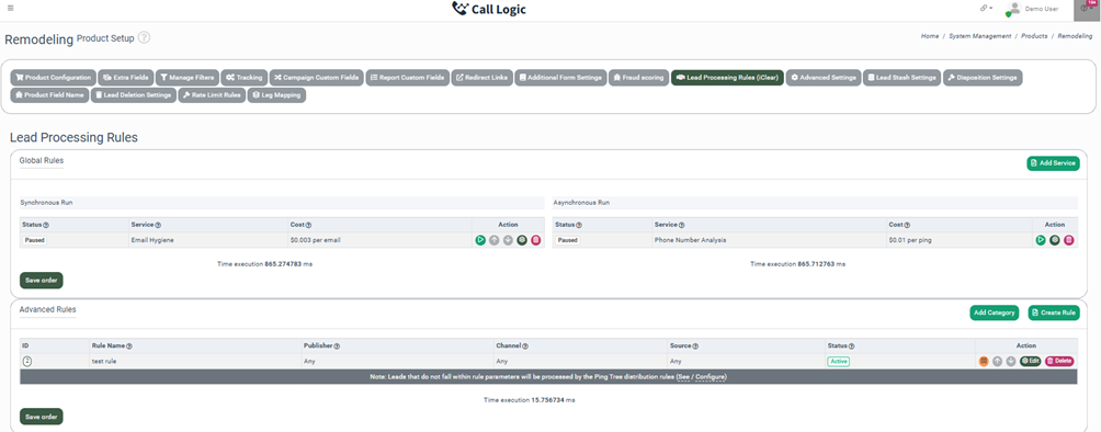
Here’s an example of an interface where you can choose between synchronous lead verification (you cannot purchase the lead until it’s verified) and asynchronous lead verification (verification doesn’t stop the buying process, so you can buy leads and verify them at the same time):
Last but not least, it’s essential that software users have a full understanding of the features they’re using or have the ability to use them effectively. For that, you need to embed prompts and links to detailed guidelines on the features you think users may find challenging. On a similar note, offering a free trial or demo can help users become familiar with your software in a safe environment without risk.
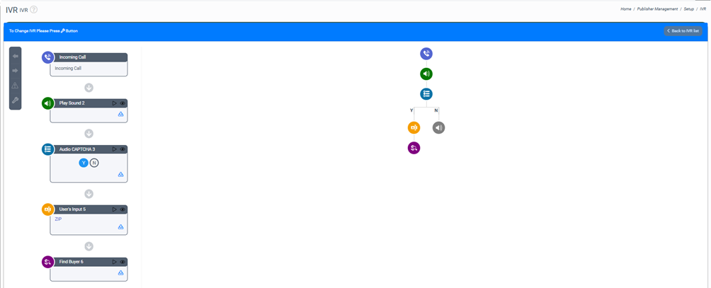
Ultimately, a good call tracking software should allow users to build their own call infrastructure and update it continuously as they collect more data. For example, if you’re using IVR to pre-quality inbound phone calls, you also need a constructor to design an optimal routing algorithm and add blocks like, say, AI call agents, if needed. Advertisers on the receiving end of those calls often pair that routing with an AI answering service, so leads that come in after hours are still picked up, qualified, and logged instead of ringing out. Teams that want callers to reach an answer faster layer in conversational IVR, so a single natural-language prompt routes across queues and live agents instead of a multi-tier menu tree.
Above all, you may need a software solution that covers phone calls comprehensively and coordinates with other marketing avenues, such as email, social media, and paid advertising campaigns. Leads can switch channels several times over until they end up speaking to a sales rep, so you need a well-thought-out system that collects, connects, and analyzes data across your marketing funnel.

