


daisyUI v5, the latest version of the popular Tailwind CSS component library, introduces several improvements aimed at improving customization and development efficiency. Since its release, daisyUI has gained immense popularity due to its ease of use, comprehensive component set, and seamless integration with Tailwind CSS. With daisyUI v5, the library continues to improve, offering new features, enhancements, and a more customizable approach to component design.
This article explores what daisyUI is, what makes it special, and the key new features introduced in daisyUI v5.
Table of contents
What is daisyUI?
daisyUI is an open-source, plugin-based component library for Tailwind CSS that provides a set of pre-built UI components such as buttons, forms, modals, alerts, and navigation bars. It aims to speed up development by offering a wide range of customizable components, helping developers avoid the repetitive task of building common UI elements from scratch.
The library is easy to integrate into any Tailwind-based project, allowing developers to create beautiful, responsive websites without needing to manually style every individual component. This is particularly useful for rapid prototyping, but it’s also robust enough for production applications. Whether you’re building a small personal project, a portfolio for your job trial, or a large-scale application, daisyUI can be a game-changer in simplifying your development process and enhancing your design.
Key Features of daisyUI
Following are some of the key features of daisyUI:
- Utility-First Integration
- Pre-built components such as buttons, cards, forms, and inputs. etc.
- Responsive and accessible
- Highly customizable
Exciting Updates in daisyUI v5
- Tailwind CSS 4 Compatibility: daisyUI v5 now works seamlessly with Tailwind CSS 4, so you can take full advantage of all the new features. It’s super easy to add daisyUI as a plugin directly into your CSS file.
- No External Dependencies: One of the biggest improvements in this update is that daisyUI no longer relies on external dependencies. This results in a cleaner setup and a more organized node_modules folder.
- Significantly Smaller File Size: With daisyUI integrated as a Tailwind plugin, only the essential styles are included in your final CSS. Some impressive stats include:
- 61% reduction in NPM package size
- 75% smaller CDN file with all class names fully supported.
- Better Color Management: daisyUI v5 makes working with colors even easier. Now, colors are stored in CSS variables, which supports multiple formats and allows for easier customization, especially when using browser dev tools.
Check out the top tailwind CSS color generators to make your project catchy.
Build and Integration Enhancements in daisyUI v5
- Full Native CSS Nesting Support: CSS nesting is now universally supported, helping reduce duplicated CSS rules and leading to smaller CSS files in your browser.
- ESM (ECMAScript Module) Compatibility: daisyUI v5 is now ESM-compatible, allowing you to selectively import and use parts of the library in your JavaScript projects.
- Prefixing Without Dependencies: daisyUI v5 enables class name prefixing without any dependencies, simplifying the integration process.
- Micro CSS Files for No-Build Environments: For server-side rendered projects (Rails, Django, PHP, etc.) or those without a JS build step (HTMX, Alpine.js, WordPress), you can now use parts of daisyUI without the full library or even Tailwind CSS. For example, you can include just the toggle component’s styles with a tiny CSS file.

- Include/Exclude Specific Library Parts: daisyUI v5 introduces the ability to include or exclude specific components. Want just the “Toggle” component? Now you can include only that and exclude everything else!

- Or, if you want to exclude a specific part of the library, you can do that too!

Enhanced Design System Features
- Exciting New “Effect” CSS Variables: DaisyUI 5 introduces a fresh set of global and theme-specific effects that can be turned on or off with ease. These effects refine the look and feel of essential components like buttons, checkboxes, toggles, and more. Currently, available effects include:
--depth: Adds a subtle depth effect, creating a visually appealing, layered appearance for components.--noise: Adds a textured noise effect to components, providing a more tactile, dynamic feel.
- These effects are easily customizable through CSS variables. Head over to the new Theme Generator page to explore how they work!
- Introducing “X-Large” Size Option: In addition to the previous size modifiers (
xs,sm,md, andlg), DaisyUI now offers a newxlsize modifier. This gives you greater flexibility in adjusting component sizes, helping you build more adaptive and responsive designs. - Refined Size Scale: Unlike DaisyUI 4, where the size progression lacked consistency, the new default size scale in DaisyUI 5 is visually harmonious and more appealing. And the best part? It’s fully customizable to suit your design needs.
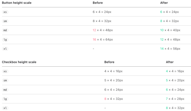
- Effortless Size Scale Customization: Gone are the days of manually tweaking component sizes. With DaisyUI v5, component size scales are now tokenized using CSS variables, allowing you to define them globally or per theme. Customize your components to be shorter, taller, or perfectly proportioned, depending on your design needs.
--size-field: Defines the base size for fields like input fields, buttons, tabs, etc--size-selector: Sets the base size for selectors like checkboxes, radio buttons, toggles, badges, and more.
Check out the DaisyUI-based Tailwind Components Library.
FlyonUI Tailwind CSS Components Library

FlyonUI is the free Tailwind Components Library designed to combine the best of both worlds: the aesthetic appeal of semantic classes and the powerful functionality of JS plugins.
Under the hood, it uses the strengths of:
- Tailwind CSS: A utility-first CSS framework that helps you build beautiful websites with ease.
- DaisyUI: adds component semantic class names to Tailwind CSS so you can make beautiful websites faster, easier, and more Maintainable.
- Preline: JavaScript headless & fully unstyled Tailwind plugins for accessible, responsive UI. Enhance experiences with animations, transitions, and more.
Features:
- JS plugins Support
- Semantic Components
- 800+ Free Components Examples
- Universal Framework Compatibility
- Unlimited Themes
- Unstyled & Accessible Plugins
- Responsive & RTL support
- Free Forever
- Beautiful and Semantic Styling
- Efficiency and Productivity
- Maintainable and Scalable
Other Ground Breaking Design Updates in daisyUI v5:
- Customizable Border Size: Borders for buttons, inputs, tabs, and more are now fully customizable. Adjust the border size globally or per theme using the
--bordervariable, making it easy to match your design style. Check out the new Theme Generator to see it in action! - Introducing New Component Styles:
soft,dashDaisyUI now offers two fresh component styles:softanddash.- The
softstyle creates a gentler, more rounded appearance for elements. - The
dashstyle adds a trendy dashed border to components like buttons, badges, and alerts.
- The

- Fully Responsive Modifier Classes: DaisyUI 5 brings true responsiveness to all modifier classes. Now, you can apply responsive modifiers like
md:,lg:, and more across all component modifier classes, not just a limited set. This makes your design even more flexible and adaptive. - Color Format Freedom: DaisyUI 5 offers complete color format flexibility. Unlike previous versions that required specific color formats for CSS variables and opacity modifiers, DaisyUI now allows you to use any color format you prefer without needing to worry about automatic conversions.
- In previous versions of Tailwind CSS (pre-4), color values had to be generated at build time, and CSS variables for colors and opacity modifiers were limited to certain formats.
- With Tailwind CSS 4, the use of CSS variables for colors and
color-mix()for opacity control means you can use any color format without worrying about transformations during build.
Fresh Themes and Styling Enhancements
- Introducing New Themes: DaisyUI v5 brings you 3 vibrant, brand-new themes to elevate your design:
caramellatte– A warm, inviting light theme with a harmonious blend of brown and beige shades.abyss– A striking, deep dark theme with a unique palette of green, teal, and glowing phosphorus hues.silk– A bold and clean design featuring crisp, bright backgrounds and eye-catching fluorescent text colors.
- Revolutionary Theme Generator: Explore the all-new Theme Generator, where you can easily craft your own unique theme. Customize existing options, extend current designs, or use the powerful color palette generator to create stunning, one-of-a-kind themes with ease.

Exciting New Components in daisyUI v5
Introducing New Components: daisyUI v5 brings several new components to enhance your UI:
Breaking Changes:
Following are some of the breaking changes of daisyUI v5
Changes in Class Names:
- Several class names have been renamed, and some unused ones have been removed. Learn more.
Breaking Changes in Configuration:
- You no longer need
tailwind.config.js—use the new config format directly in your CSS file. It’s simpler, more flexible, and more powerful. Learn more.
Removed Theme Variables:
--animation-btnwas removed (no longer needed)--animation-inputwas removed (no longer needed)--btn-focus-scalewas removed (no longer needed)
Read the complete changelog for each updated component and change in daisyUI v5 by following the links to get all the details.


